Content
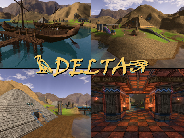
The node itself looks good, nothing to say about. There could have been a better description than just 1 sentence (instead of explaining stuff in replies). The screenshot looks well made and shows enough dimensions of the map, a pluspoint on that.
Theme
I think this theme is starting to be overused by now. Perhaps you should improve your latest creations first before actually moving alone to another one and dump it on Quadropolis.
The oasis theme seems quite original however. It has been done a long time ago in the map called Battle of the Nile (which was even included back in the good old days of Sauerbraten and lasted quite a while for a map which lacked quality, even during that time).
Texturing
You've started to improve in texturing, which is a good improvement to see. Some nice textureblending appears on the map, however some places still lack it, like at the ruins which use the block01a texture. The same case at the start of the lake; 2 textures aren't blended into each other, such a shame.
Geometry
Nice to see some hills out there. However, you should have used some bigger gridsize as the lighting highlights the odd looking holes and shapes. I guess you've used the heightmapping feature but forgot to smooth it out by hand, so my advice: smooth it out by hand (preferable with a bigger gridsize). This would reduce the amount of world triangles a lot as it currently is 131k and the mountains contain about 40k of it (which is really high for just mountains).
The bottom of the lake seems to be unfinished.
Lighting
The sunlight seems to be fine, but the lights in the temple are quite bad. While all torches are exactly the same in size and shape, they emit a very different amount of light. Try to let light-sources emit an equal amount of lightmaps to make it look more realistic.
Details
There are quite some details around the map, but they often are ported from another map of yours (the statue for example). As you seems to like the egyptian theme anyway, perhaps you're interested in the models of the Huge Modelpack or even in the Quakish Modelpack which contains some Egyptian models as well.
The small boat in the centre of the map is splitted in 2 by some copy-paste failure. Too bad to notice it.
Nice to see at least someone understands what the caustics-commands do.
The boats look quite cool. Some textures could use some texrotate or even texoffset, but not the biggest deal on this map.
I'm also missing some trees on the map actually...
Clipping
The clipping seems to be fine, nothing to say about that.
Flow
This is the last time I'm going to say it as it seems like you're just ignoring it:
Make sure ceilings and doorways higher than players can jump In (nearly) all of your maps, the ceiling of certain areas is just way too low. People shouldn't get stuck just because you're too lazy to make it just 1 lazy cube higher.
Don't add unsightable death traps in maps while not being obvious. It's quite lame to suddenly fall down while walking with no proper reason at all (especially when you would have the flag in that situation).
Gameplay
Too bad this map once again uses a lot of teleports to fix the issue of the lake. I actually miss some rock near the middle of the map.
The placement of the pickups seems to be improved compared to your last maps, but don't add that much cartridges and riflerounds. Then you're just asking players not to move towards each base and stand still instead. Putting 2 pickups right on top of each other is also a no-no. Let them struggle a bit more to get ammo, else they rather go play effic ctf instead.
playerstart 360 0 0 0 0? Looks quite awkward to me...
Overall
Instead of starting another map, you rather should fix this one and make it right. Fix thing like I've mentioned and I'm quite sure the map will look way better then it appears now. 5/10.
