As I said, this is for mac-only, wich shouldn't be taken...
As far as I know win-version and linux version have the same set up at folders, so please take that set up...
Now back to the map...
First of all, make sure the light is calculated when presenting a map! The only exeption on this is if you would have a map with an insane high ammount of world triangles (wich this map doesn't has and that's fairly good, but I'll come to this later in my comment).
Second of all, use a proper name without "-" in it, since it's pretty irritating to use "quotes" in the console line. Takes time and is unnecessary.
Like I previous said, the theme is similar to some maps I've posted on quadropolis. It's not a bad, neither a great theme, but It's (still) pretty original compared to egyptical or space-like themed maps.
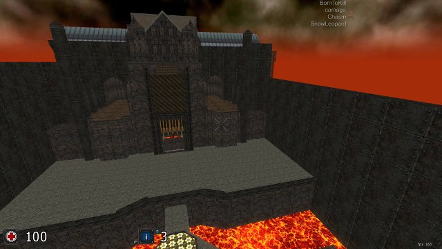
The geometry kind of sucks. I know the vision of Quake3 was to use as less triangles as possible. Sauerbraten has a similar vision, but detail counts some more here than in Quake3.
A tip when trying to create the some triangle patterned platform (like you tried at the shotgun area), try to use as less triangles for it as possible. This can be done by creating a mapmodel wich has an alpha-blended texture on it (wich isn't getting supported on the normal textures on sauerbraten) or by making the holes in the platform bigger (and clip it if necessary) or by taking a different pattern, like diagonal bars or something like that.
Also try to create mountians outside, not just a wall of steel plates.
The texturing could use some make over yes. There are already some textures included into Sauerbraten wich would fit to the theme, but that's a far too low ammount for creating a map with the current standarts. So try to look further for free quake3 texturepacks or on quadropolis for some proper fitting textures.
The detail, there is none yet...
The ligthing isn't great either. Also, add lightsources to the light.
Don't reply on this, I'm not finished yet :P
