Leiche | 2015-04-13 16:07
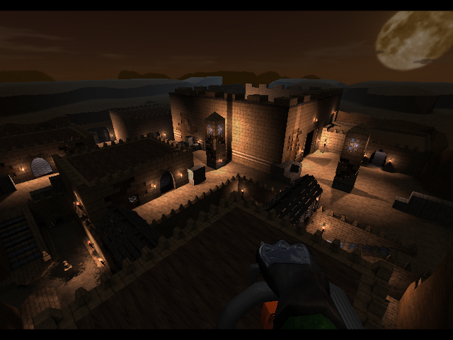
Egy (Working title)
Small egyptian themed FFA map - Not finished yet
A collaboration between Leiche, Troja, sYNDERF, 1[Ger] and [o.W.n]Darker.
The map is in a playable (FFA and Instagib) but unfinished state.
Criticism and suggestions are welcome.
egy_04_13_2015.zip (969.04 KB)
login to post comments
