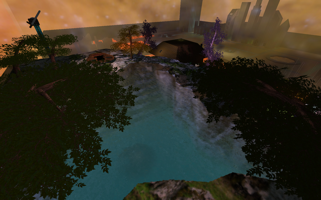
As it's your first map, I'll have a lot to comment but don't worry; I won't take every bit that could be better in the vote (although you should consider improving so).
I wrote it in such way like if you start from scratch again.
Content
Read the Packaging Guide for a proper packaging of your content.
Rather add the screenshots as a separate zip-file as attachment instead within the same zip-file as the map. It makes it quite messy right now.
Theme
After you made a layout (if you actually are making a gameplay oriented map), pick a certain theme. If you aren't that advanced mapper yet, be sure not to take a combination of 2 or even 3 themes, but rather keep it simple and stick to just 1 theme.
Geometry
If you've taken a certain theme, look at how you could make certain rooms, areas or walls less identical. Add mountains at the end of the map for example, or add depth in walls with some columns.
Texturing
If you've added more depth in the layout, consider which textures would fit them. As for example, metal feels pretty good for a futuristic theme while wood often doesn't. But watch out for if the particular texture actually fits the surfaces which it is attached to. If it doesn't even fit the surface, then the theme isn't convincing at all in the end.
Lighting
Read the Basic Lighting Guide for a more proper lit map.
Detailing
When you've managed to add some well aimed lights into your map which added contrast yet enough light to see (nearly) everything, it's time to add details which really convinces the player he or she is navigating through that particular environment. Think off torches, banners and swords when a map is castle-themed, or electricity, pulsating lamps or fluid, metal door panels, space skybox when the map is futuristic themed.
Clipping
As you've added plenty of details of course, those should probably be clipped, else no one could navigate properly through the map without getting stuck (or stopped) somewhere while jumping around. I refer how you should do so by clicking on the link at the flow paragraph.
Flow
Read the Flow and Layout Guide for a more properly flowing map.
Gameplay
I refer towards the flow paragraph as well for the placement of playerstarts and teleports. However, please read the Gameplay Entity Guide for positioning flags and bases properly.
I'll vote 2/10 so far.
P.S.
I know this is a conceptual map, but I'm quite sure you could use such info if you start making a gameplay oriented map.
