Meh.
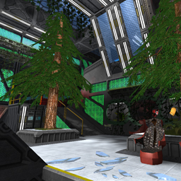
You've made a lot of nice details, and the overall layout is okay, but there's nothing that really stands out to me about this map. It seems like it's more a part of your single-player story that turned into a multi-player map.
I will say that the colors might be a bit much, but it is much nicer than some of your earlier space maps which tented to just be lots of grey.
Also, I found some skytexture clearly visible in-bounds. (it's on the other side directly opposite too.)
http://imgur.com/SNfNeVM
You should probably also clip the entire outside of the map to save on rendering time, especially since you can't get out there.
[Edit: I fail forever at embedding images]
