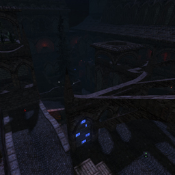
Still lot of clipping mistakes on the walls (those arches could be clipped smoothly for example). Same for on top of the roofs (there's no need to be there for players).
The backface of certain details still could be skytextured to save up light-maps (the steel ornaments on top of the huge long hallway for example).
The map still contains a lot of continuous stairs (while there have been mentioned not to use so already before, too bad).
The next pulsating detail on the wall isn't that great looking and kind of dull (it changes from blue to red back to white for no apparent reason?).
I'm not a huge fan of using swamp-themed trees in some garden environment. It feels pretty unrealistic to me. Perhaps you could use another tree model instead.
Cute water (and details like a light-tower or ship) on the walls, but what are they really fitting the theme of being a ruined cathedral? I think not. Nice try though.
The stairs aren't flowing when walking up. What about trying to use a bigger grid?
The layout of the map is way better than previous of your maps. However, it still contains a lot of long boring hallways, even some which lead parallel next to each other (while only a paper thin wall separates them).
I think you're on your way to make something good...
