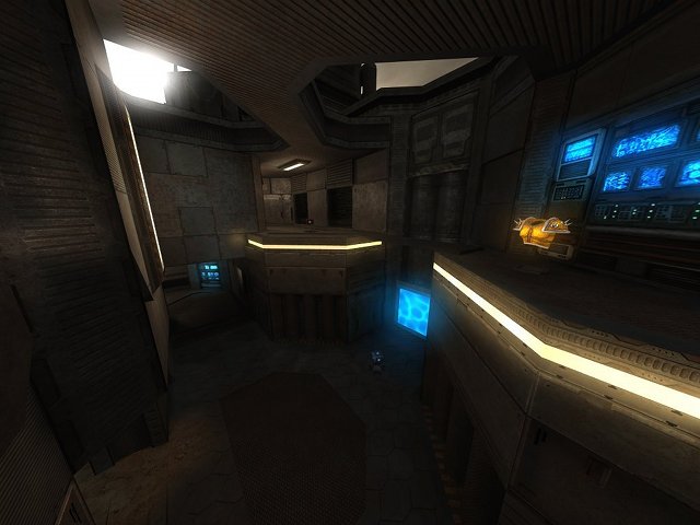
Time for me to comment.
Somehow, the texturing seems right after calling up your version of package.cfg, but I still get some texture errors (somehow you call up files which I've never actually added in the 256p version, as it like ex_wall_pipe_h.jpg, q2_01e_s.jpg and q2_01e_local =S). To avoid any more confusion, please call it package_stahlbox.cfg or initate all textures right into stahlbox.cfg. Why? Because I might want to update the eX-package in the future which would make your map incompatible with it (that's why files as package.cfg are pretty evil config-files, they mess things up).
For example, I could add meshes to the grate textures so they really can be used like a grate (that wouldn't affect your map directly, but I often make small changes also like fixing up those missing files).
The trims which carry a light-texture in the centre of the map feel like they should emit some light. What about trying so?
You could actually fill up the outside of the map with more skytextured cubes, as Cube Engine 2 recognizes that the end of the world "has moved" (should save up wtr and looks more clean). You can also raise the clipping on top of the map while doing so.
It also avoids people spawning outside the map, even if there wouldn't be a bad placed spawn (as someone else already stated a bot spawned like that). Don't be afraid, it's only a few minutes of work.
I've found a small clipping bug on the map; you still can get "stuck" there or jump on the side of the wall (same counts for the other side of the room).
The bug

Finished skytexturing and clipping

Now about the gameplay;
I like the fact that it's more of a kind of tourney map (despite the fact a HB spawns, there is no quad which creates invincible monsters in the right hands).
I'm not sure if you should add bullets and riflerounds together, as they are both are still powerful weapons compared to some others (the pistol, shotgun and grenade launcher). Then again, the rest is placed pretty balanced so maybe you should just forget it =P.
Now about the node;
In my opinion, this node could be promoted to the front page. Anyone (preferable admin or moderator) which agrees or has trouble with it, send me a private message or email instead of starting a flamewar over here.
In overall, I would give it a 9/10 as I like nearly everything except the white.jpg which you've used as a trimming, it feels too dull compared to the rest (I know, the eX texturepack misses something like a proper tileless texture. You could also use those of the e6, dsi or e8 texture pack (e8_base1b.jpg seems to have nearly the same colour as the current trim, but with some more contrast in it).
There still is some small work to do on the lighting (as I mentioned), but the gameplay and flow feel great. That's why, 9 out of 10!
P.S.
It looks even more awesome in the 512p version of the textures ^^!
Edit:
Seems like some other admin/moderator agreed; congratz, it has now been promoted to the frontpage.
