Content
I start to consider not to download your content anymore as the packaging keeps being horrifying. People (and I) keep mentioning you should package it differently, yet it seems like you're giving it your own twist.
As you probably are going to use more custom (map)models, skyboxes or even textures, I would advice you to put them in seperate folders like this:
Mapmodels: packages/models/mapmodels/pyccna/
Skyboxes: packages/skyboxes/pyccna/
Textures: packages/textures/pyccna/
Why I even suggest to do so? For several reasons:
- It is way easier for you to find back your content after a while within your very own Sauerbraten directory.
- It is easier for people which download the content to find all related content which requires the map back.
- It keeps the Sauerbraten directory less messy as it already is (even with the seperated MyGames directory, it turns out to be a mess after a while as people still just dump their stuff as quick as possible).
Why I won't suggest to use the name of the map?
- As you might want to use the content on another map also, which makes it look quite odd (and illogical) when downloading the latest map which runs with the elder packaging.
- As other people might like to use the content also. Why should they actually have to reference a map which isn't in their packaging? Let them rather reference to the guy who actually packaged the content.
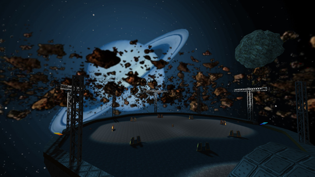
The screenshot seems ok, nothing to say about that.
Where is actually the license of those skyboxes? There is only a quick reference to NASA but that's a pretty big organization.
Texturing
The texturing could be done better. It's quite plain. The planel2a texture of trak5 has been really overused (seems like there has been relied to much on the trimmings inside the texture). Using the light1a texture of trak5 on a wide spread area looks pretty odd.
Using graypanel3 of trak5 on the outside looks really weird and isn't fitting the geometry at all.
There hasn't been any textureblending as far as I could see, too bad; what a missed chance.
Geometry
I'm actually quite surprised that the map still consists out of 163k of wtr while a lot of models have been used. My best guess is the trimming which is on top of those long paths takes a lot of wtr (and is textured very choppy?).
Lighting
I've noticed you've set the mdlambient really high (it normally is 30, while you've set it to 125!), while you probably haven't played with mdlfullbright, neither with mdlglow (which only actually is effective when using a mask, but that's done very easy by specifying the skin once more).
The rest of the map has a pretty plain white lighting which feel quite boring.
Detailing
While I often advice mappers to use more models, I would rather advice the opposite this time; use less models. Those asteroids don't need to be models, neither those barricades (why are they on the map anyways?).
The asteroids use way too much vertices than necessary and it seems like you haven't used remip before exporting them?
Using those capturemeter-particles as lighting or notification of a jumppad is quite original, but too bad; they are rendered 2D. This makes them appear quite odd in a lot of angles (except when you appear from front of course, but that barely happens).
Clipping
Clipping seems one of the best things on the map, not much to say about that.
Flow
The flow of the map; well there actually is barely. All platforms are on the same height (with 1 top layer on the paths which lead towards the platforms, not a big hit either), while some small barricade is the only thing which provides a little cover on the gigantic areas.
It's better to set the jumppads with a strengh that you actually have to push the forward button also to get there, as players tend to press that button 24/7 anyway. It would make it feel odd if you suddenly have to release the forward button to get to a specific area. Of course, you should keep it quite loose so players won't die due lagging or just let the forward button slip.
You've ever checked out the map called asteroids? I would advice you to do so as that map provides nearly everything which this map tend to lack.
Gameplay
I'm not font of concentrating pickups that close to each other on such wide open map. That just asks for trouble when someone tries to pick any weapons or health up.
Seems like you've added enough playerstarts, good job on that. Still quite odd that you've placed playerstarts facing the other direction as a jumppad goes (to the centre of a platform) as another player could just take a ride from a jumppad on the asteroid while you spawned, which means a cheap kill for the opponent while you die once more.
Overall
You should pay more attention to your layout, spend more time on just 1 project and look around on maps which have already been released. Don't try to invent the wheel another time, invent a way to make it roll better.
I'll rate it 4/10 for now.
