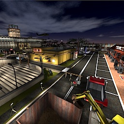
Time to judge this map.
Content
You can see you've putted a lot of effort in the map. That can be a good thing, but also a bad one. Why? I'll explain that in the next couple of cases.
Some points which could be improved content-based:
- The packaging isn't right at all. The models should be in the mapmodels folder.
- Don't just dump the read-me file into the zip-file without properly naming it. Name it readme-actiontown instead and include it in the base folder.
- Don't use uppercase symbols in names of folders or files. It's completely unnecessary and makes it harder to configure for other people.
- Delete unnecessary folders like MacOSX, other people don't need it to let the map run properly.
- The models which you've used were already imported and configured properly (and with bump-mapped skins and masks also), ironical by me. I would suggest to use them, as they are already correctly packaged and configured. They are obtainable right here.
Theme
The theme is one of it's strongest points - it's obviously urbanic. Nothing to mention about it.
Texturing
When starting up the map, you begin your journey with a lot of messages of textures which could not be loaded. This is being showed of on several buildings (as they are displayed with notexture.jpg).
There appears to be a high variety of textures. This can be a good part, if they are matching. There are several cases which it doesn't (just observe other maps in the official release to get some idea of how it should be done)
Geometry
The geometry is a disaster. As already being stated by others 825k of wtr isn't playable at all. It seems the building which is occupying 1 side of the map contains the most geometry, so I would advice to optimize it.
There is also a lot of geometry right under the map which has no purpose at all. Just delete it.
A small tip when using very small geometry near water - don't. Why? Because the water material in Cube Engine 2 reflects nearby geometry, which makes the map even harder to render.
Lighting
The lighting isn't as bad as I thought. Won't say anything about it.
Detailing
The detailing, where there is plenty of, but quality-wise it's not great. Mapmodels have the power to enhance a map greatly, but their magic drains when being used multiple times. Most mapmodels shouldn't appear more than 4 times as the realism decreases when you see several identical models near each other (with exception of torches and other light-source based models, they often can be used way more times while preserving that certain realistic feeling).
The mapmodels won't show up in the way you've configured it right now, as the mmodel command starts it's journey looking for a model in the models folder.
Clipping/Noclipping
The clipping also, is terrible. You can easily get out of the map (and actually "wallhack") by getting on top of that, town-hall? and jump over the wall of clip. So extend that wall and make a ceiling of clip also.
I think we're going to change one of the commandments - IV: Thou shall not use the clip/noclip/gameclip materials in thine first three maps (for details of the commandments, see here).
Flow
The flow, there actually is none. This actually would be one of the reasons for someone which seems to be new to Sauerbraten not to make such huge project like this, as it just isn't playable at all. Why it's not playable at all? Here are several points:
- Every ceiling and doorway is too low, as you bump your head against it and are being stopped because of that.
- The doorways are too narrow also, as you have to put effort to access several buildings.
- The hallways are too narrow also, there isn't any space to strafe properly so you could avoid any attack from your opponent.
- Don't create paperthin walls, as the explosion of the projectiles which rockets and grenades launch go right through it.
Just check out maps which are included in the official release to get some idea of a proper flow.
Gameplay
There is no gameplay also. You've stated it's design for capture, but capture also needs pickups (like health, green armour, yellow armour, quad or healthboost). Next to that, a map shouldn't be focused on modes which aren't containing pickups, just because the creator has no experience in placing or just lacks the will to do so. It's part of the game which should not be excluded.
Overall
When positioning an enity, use /entselsnap 1 (bounded on the key 6 by default while being in edit mode) to make it move along the x, y or z axis (because of this, you can position entities in a perfect straight line).
There has been put a lot of effort in, but it reflects the lack of experience of the creator. I would advice to start with a way smaller project next time, so it takes less time and effort to improve. I can only give 3/10 for the effort.
