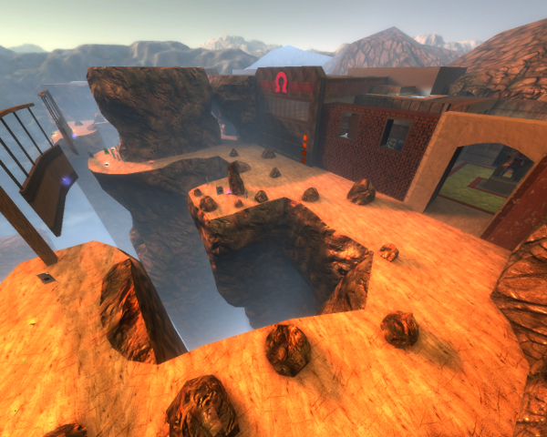
Seems something different to comment on then Sauerbraten maps only.
Content
The screenshot seems to be quite hopeful, but it doesn't look that great ingame. If you would look only to the screenshot, then you can already see some flaws, but I'll talk about that in the following points.
Theme
The theme is pretty interesting, as it doesn't seems to have any theme. Some industrial spacish trak5 textures has been used, while also some urbanic brick-textures appear on the map (but it appears can't be urbanic because of the which are present in the map). So add a proper theme to the map, instead of just adding some textures to certain geometry which maybe would look good.
The name could be used as a proper theme either, by adding more details which fit to it (like brown iron constructions, some moss which grows on stuff, etc).
Texturing
The texturing isn't that great, well in most cases because there isn't a clear theme. The banners which let players walljump/run to the other side are textured pretty odd, as some fat trak5 texture is used as a trim for holding wooden planks which are just as long as the trim, while it's being hold by another trak5 trim which doesn't seems to be the correct texture for it. There are several more of such examples around the map, so move around and think what looks pretty, while what doesn't look pretty either.
A different lava texture could have been taken, as this one really looks very cheap and unrealistic.
Geometry
The geometry has been done just cheap in several places. The rock walls aren't finished at all on the top (as they are just cut off; I've never seen that in real life and I doubt you did) and there are a lot of geometry errors.
Lighting
The lighting is somewhat the best part of the map. Everything is lighted "ok", as enough contrast has been provided over the lighted areas. Only the skybox isn't fitting the sunlight at all, as the sunlight is way too orange for such sun.
Detailing
As I already stated in the theme, you can add way more details that would relate with the map's name.
Clipping/Noclipping
The clipping is done quiet good also.
Flow
I don't know a lot about the flow of Red Eclipse (as I'm not that used to it), but every game has this in common; don't add paths which are accessible from only 1 way, while they look like they are from both ways (as for the skytextured one-way cubes). Make sure there is some sense in it why you can't enter certain paths, use a trapdoor or something similar which can only be triggered from 1 way for example.
Gameplay
As I don't know a lot about the gameplay, I can't really tell if it could be better or so.
Overall
The map seems to be playable, but isn't having the eye-candy as it should. Fix the stuff which I've commented (but not just that!), and I'm sure the map would be improved a lot.
