Hey! You stole my falling sand idea! :P
Heh, just kidding. Even if you did, I don't care.
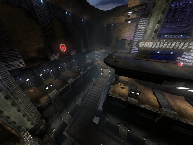
An interesting map, it definitely shares some similarity with may map, in particular the sand & metal feel, though your sandy areas have more erosion.
The texturing is a little too crazy for my tastes; it looks like you used most of the textures from Lunaran's textureset. You could especially tone down the use of glowmapped textures--there are way too many point light sources. (Not the light entities themselves, just the textures.) You could also consider using strip lighting, which is somewhat easier on the eyes.
I'd also suggest hollowing out the falling sand column so that if you go through it, it seems like you're actually in it.
Oh, and one little slip I noticed: if you look at the sandy area under the yellow armor, it isn't clipped. One can easily get stuck on the metal bits.
Overall, architecturally nice, but doesn't appear especially playable.
