MisanthropX | 2008-10-17 11:16
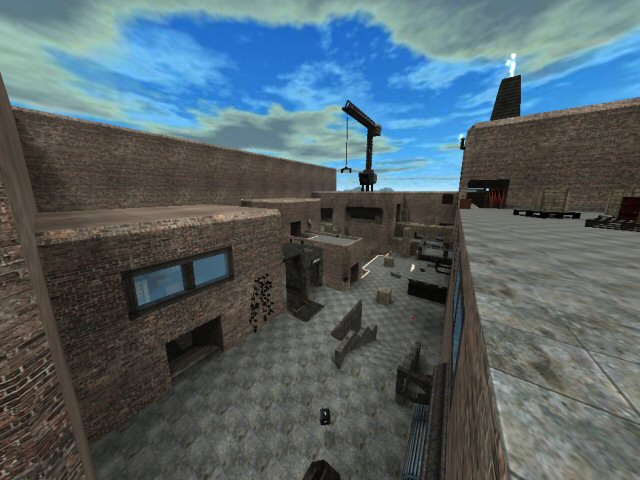
Warehouse
Cube 2 (Sauerbraten) | Release | Final Release | Deathmatch | Small (1-4) | Copyright | Packaging Problem
Files in this content are improperly packaged or presented.
Refer to the Packaging Guide for information on how to fix this.
First ever map > Warehouse
its my first ever sauer map. (yes really)
TUX (maker of night_capture or smth like that) helped me first time gettin started with sauer. but i made most parts by myself ^_^
i always thought its too bad for upload . its "just a map".
but well.. its better then some quadro noob maps.
i did this map when there was no little gridsize
but i did one or two "details" today before uploadin just for fun
Warehouse.zip (428.68 KB)
login to post comments
