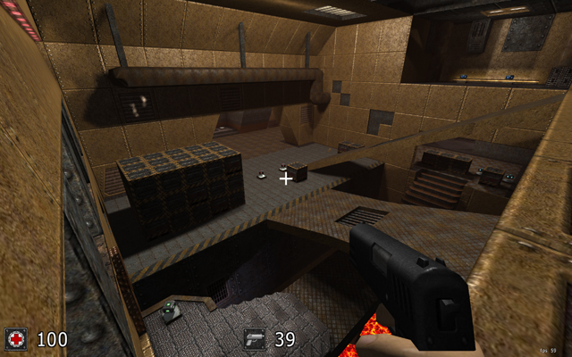
I quite llike this.
The biggest problem in your adoption is that it lacks proper spacing. The middle bridge takes one single jump to go from one side to the other. Getting to quad can be done through a rocket jump, yellow armour through a rifle jump, lava's area should perhaps be bigger.
Because of Sauer's jumping everything seems to go wrong. The map is simply made too small, should be much larger. The bridges should be more in proportion (more like [space]:[vertical-bridge]:[space]:[lower bridge]:[space]:[space] where each item is in ratio of 1 to eachother).
Another criticism is the texturing and lighting - You could have chosen a more mixed set of textures (I might be wrong).
Lighting is very simple and does not feel too amazing to be in.
Conclusion: increase the size :).
Flack room should be much longer and wider too. Boxes where DoubleDamage in UT sit should be only accessible through a rifle jump. Quad should be accessed through teleport or something simply harder/more innovative.
My criticism, hope it helps :)
Oh, by the way: I give you 3/5 for now. Wanna see it improved :-)
