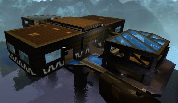
just downloaded ... already wondering why this small map is ~3MB ... inspecting the ZIP...
Unbelievable amounts of cruft ... a WiP(?) version of your RTF document nobody needs, the BMP (1.9MB) of your screenshot and a backup of the map itself.
Two thirds of the ZIP are just that bitmap ... why did you include it?
The RTF document consists of two lines - please use plain text for this type of simple README; on more complex ones HTML would be the format of choice ... RTF is just plain silly IMHO - I need to fire up some WordProcessing for it to display nicely - waste of time to read those two lines, TXT would have been absolutely sufficient.
Oh ... and you packaged it all wrong ... read these articles :
Distributing Maps (wiki:general info) and Quadropolis Packaging (here:specifics [but still WiP]).
Now on to the map. ...
Mmmh.Overall I think it's too narrow and crowded with boxes,
there's a lot of very deep shadows in it so I can't really appreciate the effort you put into quite a few parts of this map.
I also had a lot of trouble with the ladder coming out of the water, but jumping onto it works ...
Although the screenshot looks quite promising, when walking around I couldn't see myself having any kind of instagib fun on it ... without some ammo on it it really isn't good for any other mode.
Please free up some space for movement.
Please fix up the lighting - like make those floodlights really flood light - and reduce (not eliminate!) the amount of black shadows.
Please make some additions to the map - like more space maybe (e.g. more platforms) ... how about just copy-n-paste this one a little way away from the first and have teleports between them - then you could have some long-range sniping situations crop up ... I just see a lot of shooting in the back while running to some ramp/ladder the way it is now.
Please consider just placing a few .. oh, say, rockets around .. to make it more universally usable.
