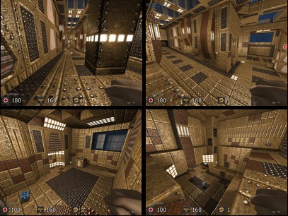
Hm, nice try for a first map.
Lighting is way too bright, though, there are no shadows at all, and the light´s ranges are way too big (1 single light 255 255 255 255 is already enough for a complete big room). Texturing is ok on most spots, i like the floor texturing on your map, but there should be some more dark textures, too (especially on the walls and ceiling), it simply gives a nice change then.
Your map layout is interesting, but way too narrow. Connectivity could be a bit better, too.
I like the room with the healthboost, there are 2 ramps which provide enough space to move. If you could make all hallways and connections on your map in that size, it would become good playable, i guess.
Personally, i like the idea with the water, but it slows down the map dramatically.
Seems as if you already have put a lot of work into this map, though as it is now, i´d not rate it higher than 3 stars, even if there was perfect lighting ;)
so, 3/5 ;)
