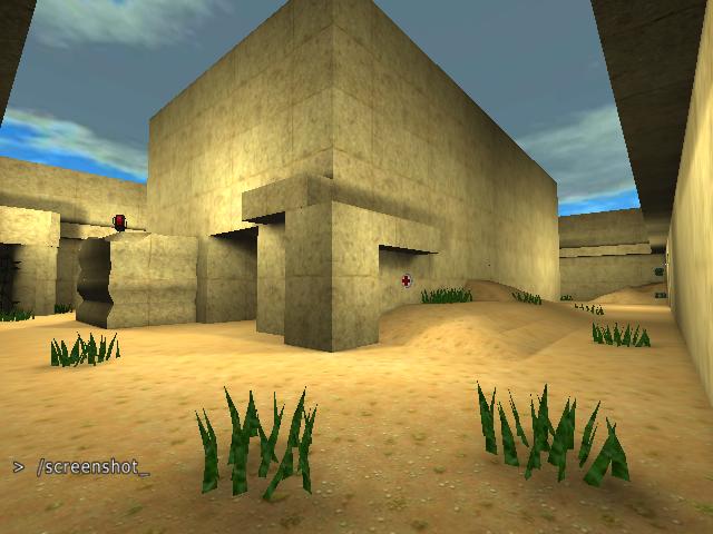
Well, I don't find it that cool actually - no way it's worth 5 stars!
It's really very small - I think 6 players would be way too much for it.
Also you've not taken much work on removing the blockiness from it ... excluding that small part visible in the screenshot with the weird side, the map would improve a lot if you did ;)
The part where you've placed your water definitely needs some more work too - it's way too shallow, making the water animation look all wrong!
Your use of the steam particles - while nice to use a new feature - could use some finetuning too IMHO; at least move them close together to make it less obvious there are two sources ;)
Don't go slapping mapmodels all over the place hoping they'll add "depth" to your map - use geometry and textures for this;
you've only used about 3 textures (and one of those is the sky!) in the whole map if I'm not sorely mistaken.
