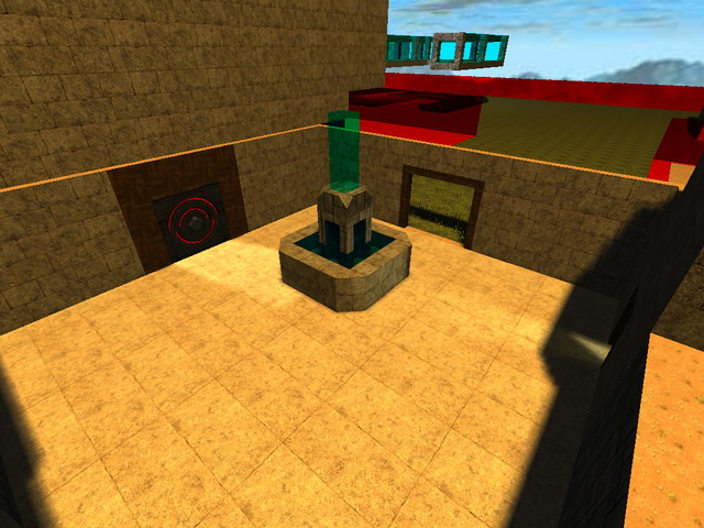
First off, your overall map concept is great. but your execution is lacking in detail, time, and design. you ultimately need to spend MUCH more time detailing each area within your map. there are rooms with light, but no light textures, etc...
you should also learn to use the door triggers, map models and the "Q" + mousewheel cornering tool more effectively.
i suggest that this map is very much worthy of "fixing-up" and detailing. if you spend more time on it and improve it - i would download and play it again for sure.
last thoughts:
1. the glass area to open the switch to the armour room was awesome, but i would suggest not using the light texture for the entire bottom of it...(and maybe add a few more monsters in there?)
2. the last room IS KILLER SWEEEEEEET!) and for that alone, this map is already worth playing through once.
Anyone else have thoughts about improving this map? This mapper deserves credit for his work so far, and i'm sure we all can help with some more ideas on how to make this map awesome!
RATING: 2/5 stars
- JUNEBUG
www.SixDogStudios.com --
Sauerbraten & CUBE Maps, Music, Sound FX & More!
