Hi mIscreant,
finally found some time to have a closer look at your map. As i told you already, i like your maps and they´re getting better and better each time you publish one. ;)
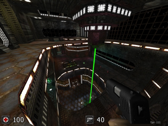
Very nice layout this time, many good ideas and the rounded edges fit very well.
Pickup placement seems ok too, about the textures i can say, the overall look could have little less of these brownish textures (makes lighting look kinda ugly sometimes) , also more different bright/dark textures to have more contrast (would make it easier to navigate by orientation through the map).
I also recognized that you´re using many light textures, about which i only can say: "less is more" - believe me, i made the same mistake in many maps ;)
I´ll tell you what i think about the playability as soon as i´ve tested it in mp,
atm, i´ll rate it _at_least_ :
4/5 ;)
