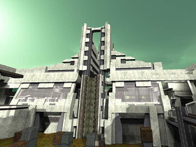
After a LOOONG hiatus from map-making, here's my latest release. Breaking from the "core_" themes of previous maps, Deadworld takes place in a future scenario where nature has been all but eliminated, water is deadly to the touch, and anybody with sanity has long ago uploaded themselves from this environment. Only the Ironsnouts remain (or whatever player you choose), and they hasten their demise by struggling over the final scarce resource: flags.
I'm open to suggestions on how to improve gameplay/aesthetics. With my last maps, I made them far too large and open. This time I tried to give plenty of options for movement, while discouraging campers by blocking strategic vantagepoints or making them exposed. I also really stretched the philipk textureset. Speaking of, you'll need this package to properly load the textures: http://quadropolis.us/node/3163
License: free to use/modify for non-commercial use, and with credit given to the author
Things I haven't done:
-lighting: I accidentally did all the lighting with alpha=160 on my monitor. Not sure how to fix the result, since ambient or skylight don't do the trick. Open to suggestions
-ents: I didn't bother putting in shells, bullets, playerstarts for FFA, etc.. Insta CTF is my favorite format. Now that all the lights and playerstarts are in place, I'm not sure how to make a bunch of new ents and copy/reflect them (since N selects all ents). Again, please tell me
-textures: I used texcolor to indicate each side, but a bunch of textures are green on both sides. I'm concerned about load-time if I duplicate basically the entire texture set with magenta coloring
-periphery: most of the detailing is in the playable areas. The outsides are pretty bare
Enjoy the map! Let me know what to fix; I've forgotten a lot of editing tricks in the last decade. And, don't take a swim.
