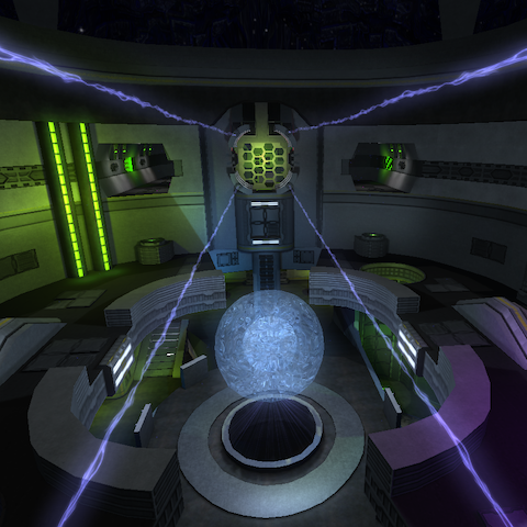
The map feels as it's theme; space. That's a nice thing to start with.
The atmosphere feels good. Everything is lighted equal, yet providing enough contrast.
There are plenty of details around to stumble upon.
I do like the use of the computer model integrated in some geometry and the giant transparent ball in the middle and the wiring on some ceiling looks really cool also.
There are details within the map that are some what spammed; the hexagons can be found throughout the map everywhere, while it consumes a lot of performance (and wtr, 20K for each side seems way too much for just some general wall decoration).
It could be made more simple to still be recognizable, yet not heavy.
There are no sounds so far within the map.
The clipping could be better; The ceiling on top of the map is containing a strip of clipping material, but that doesn't matter in the sense of performance. Cube Engine 2 won't calculate anything for rendering when it's inside clipping material. Due this, framerate could get cranked up higher (as it just ignores the probability the client could view the map within that scene).
Also, the trim on top of the platform of the flag isn't noclipped; which feels awkward when running off.
The flow of the map is generally fine. You can jump around pretty good with no major hickups.
I'm not really font of the fact that you're forced to jump twice to reach each flag, while it's such a small height difference between the floor and the actual platform. A round stairs for the first ring would fit more in my opinion.
You notice right away this map had a lot of work already. Due this, it could even become better. I like it so far.
