Fatality | 2016-05-19 23:35
rkc2 and Fallen
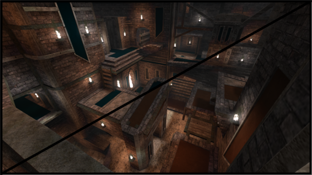
A two-pack of a Capture map and a CTF map
--- Edit 1 ---
Some layout changes.
This project started as a capture map (Fallen), but then was flipped and mirrored to suit CTF gameplay (rkc2). Both versions are included in the zip. Feedback is welcome, enjoy.
rkc2-fallen.zip (5.62 MB)
login to post comments
