ZETA | 2015-01-15 22:22
Elements
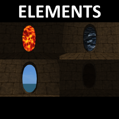
A small map with 4 different zones
This map has taken quite a while to make - i overhauled 3 of the zones twice over before I was happy with them, but here it is now :)
Its a small map based around the 4 elements. There are 4 themed zones that feature a specific element (earth, air, fire, water). Not playable, but was very fun to make and to wander around in (for me anyways) :D
feedback is golden, as usual :)
elements15jan.zip (2.9 MB)
login to post comments
