nef | 2015-01-13 15:44
Water Temple
Cube 2 (Sauerbraten) | Release | Work in Progress | CTF | Huge (16-32) | Creative Commons (BY-NC-SA)
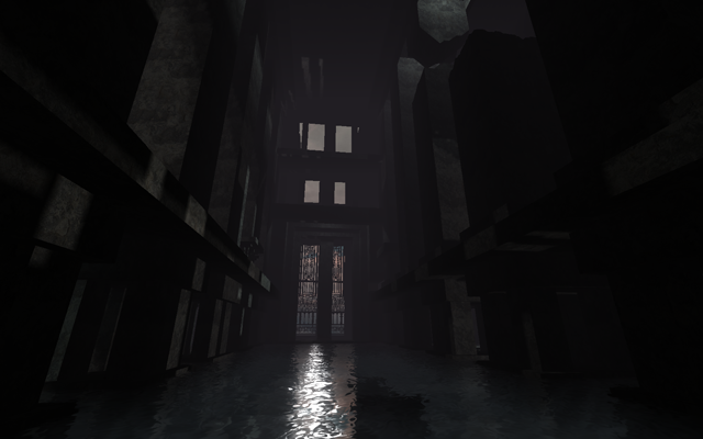
CTF map with secret, ambiance and frag! Tribute to Ocarina of time and Golden eye
At the beginning it was a CTF map but with some modification you can play what ever mode you want. It's not finish. I need feedback. So play it and tell me what you think!
They re the lot of secret in it! Try to find it all and use them to be the best!
watertemple.zip (1.87 MB)
login to post comments
