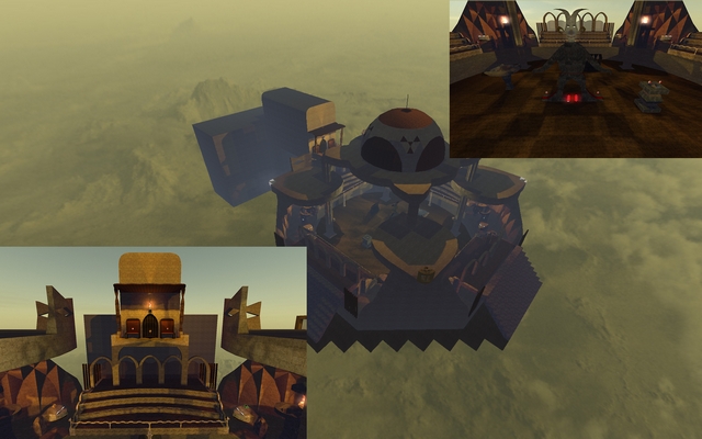
The node itself and the zip-file looks clean, while the screenshot looks pretty. You've done a good job on that. The theme has been done before by others and the problem of a colosseum is that's often symmetrical; while for the gameplay and flow it shouldn't (I'm assuming this map is made for deathmatch as no flags neither bases are included). This can be solved by having one side being nearly completely ruined like if some bomb, earthquake or large comet just hit the building; but that often takes a lot of time while there are much easier themes to perform. That's why this theme isn't chosen often.
In my opinion, the texturing should be kept just to 2 sets of textures; not countless (dg, tech1soc, than_ind, ik2k, ikbase, subverse, nieb, trak5, the list just doesn't end). So stick to 2 specific sets instead of just a few of dg and a few of trak5. Those textures just doesn't seem to fit each other.
The lighting feels pretty odd to me; there's some crystal on top of that dome which emits a HUGE amount of light; while the sun doesn't. I would advice to drop the crystal light-source idea and keep it more realistic. There are many more of such examples about the lighting around the map. Just make sure a light-source emits a realistic amount of light with a proper colour also.
Nice attempt though.
