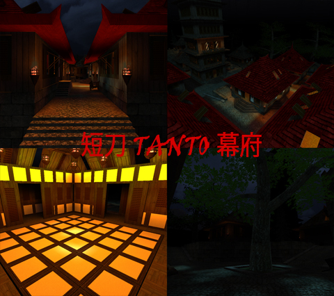
Here some opinions and suggestions:
-This map is pretty good, definetly, to me, one of your best.
-i like all the buildings and textures (except for some spammed in one place)
-i like also the black fog, not for the playable part of the map, but for the background is very good.
-The level of detail is enough, but not for my taste, i like the level of details that misan and t-chen did in tempest, but thats is a master piece, and is out of our normal human capabilities.
-there are 9 terraces that are dead ends.
-i recommend you to delete that ladder in the river and make the borders more accesible, more easy to reach.
-the stairs all around the map looks rough, they dont have a nice shape to the look, make them bigger, the steps, and maybe not too diagonal, add to them some contour.
-some textures are bad placed inside in the ceiling of the buildings.
-the spiral stairs in the big tower is very uncomfortable.
-there is an arch in front of a stair that hinders.
In general, i liked the map layout, its very simple, its not symmetrical, and i like that, the details are good, i dont have problems with the light, they are working for me, and the background is well done,
i'll give you a 7/10 = awesome, if you fix most of the issues, i will re-vote 8/10 because it map deserves an 8, wich is a very good, considering i haven voted that high like since one year ago.
Greetings.
