these days i like to keep my mouth shut, but FINE ILL MAKE A COMMENT.
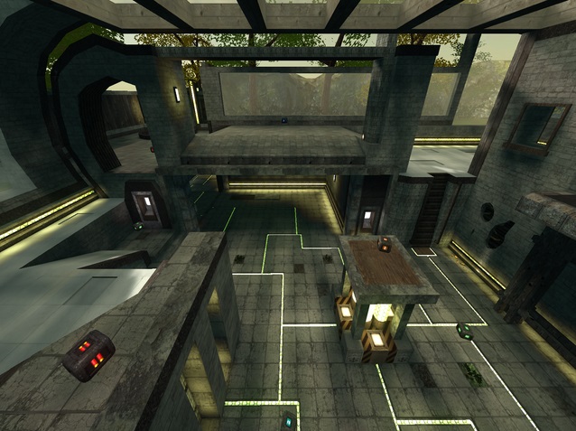
The Good: The majority of the map has the stony "energy" theme which I think is a good look and I like the growth which shows how long its been abandoned. Also I have no problems with the weapon placement except maybe you could put a greenarmour or HB in the far empty corner. Also the teleports are interesting and a different twist.
The Bad: No playerstarts?!?! Also you should end up clipping so that nobody can climb up over the map and see the untextured stuff but I'm sure you know this already. The aesthetic aspects of the map are what stood out to me. I think the texturing was chosen poorly. You should just stick with the theme I said above instead of trying to put wood, nature, white tiles, and stone floor all into one. Another thing is that the wall and floor colors are very similar on the lower portion of the map. I would suggest you use the contrast like on the upper portion with the white and the gray instead of the gray on gray stone walls (or something of that nature). One thing that really bugs me is having arches that cast those annoying shadows but I understand that may just be the way it is. I also realize that this game is called Cube for a reason, but it's too blocky for my taste, even add some trim on the upper white floor to not make the edges look so sharp and square. Another thing I don't understand is the ladder and jumppad together, just make it one or the other! Maybe like the adjacent pad with the arrow would suffice; and the missing chunks of the tile don't make sense to me either besides adding variety. The outer wall that is outside you can ride n glide on the corner, I would say thats a big no-no. I'm not a fan of the spotty yellow lights on the edge of the floor on the upper part make no sense to me as the light textures are moving, not much point to circle lights. Finally I must allude to my comments on the growth of the vines and trees or whatever, some stick right through the glass! Impossibru! From a gameplay standpoint, I'm not a big fan of the outer upper portion being so wide open with no cover whatsoever but I think I'd still enjoy myself. Other than that I think that's all from me.
I hope this is good enough comment for you why I say 3/10. I know I only really focused on the bad, but you want to know ways how to make it better this isn't some place to make you feel better about yourself. I just trying to get the best out of you! Nevertheless I realize this is your creation and not mine, and some of it is just my opinion... however if you need further clarification like a picture from me or something than I'd be happy to show you.
P.S. - Have you ever played Portal 2? Some of the ideas remind me of the beginning levels where you awaken and do tests in the abandoned test rooms with lots of natural growth, I think piggy-backing on that idea would be awesome! Here's a picture of what I mean: http://bit.ly/TS4skW
P.S. Encore - IM NOT LAZY заткнись, до свидания
