At least you keep trying ...
Packaging:
A screenshot as a .png wont show up in the loading screen. Use .jpg instead. There also is a nice screenshot tutorial on the cubeengine wiki. Never ever use capitals in filenames.
Theme:
Not existent. Failed to copy the style of the map alithia.
Texturing:
Still very boring, although you tried to make some trims now.
Geometry:
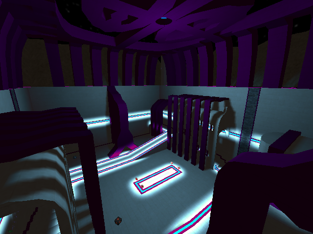
Besides the layout, this is the worst part of the map. The arches and some other parts just look like crap (sorry, but that's how it is). Make a decision: Either make round shapes or make something with 45° angles or just stay cubic. Mixing it up the way you did makes it all look retarded. The terrain in the background is probably made using heightmap? Make terrain by hand, always looks better (see the map turbine for exmaple).
Detailing:
Not existent. Especially those empty, flat walls look terrible. I don't have a solution for that, it's the result of the empty-box-layout, which should have been avoided.
Lighting:
Better than in the first version, but still bad. The light in the roof looks very dark, while it emits quite a lot of light, the lightsource is far away. The trims are somewhat turquoise, but it looks like they emit white light. It simply does not fit together.
Clipping/Noclipping:
The yellow armour place is accessible, but the higher arches not? Feels quite unnatural not being able to go there. Either remove the clipping or make the arches go up to the roof, so players won't even try to get there.
Flow:
Well, it's an empty box, so you can actually move around. The only ledge you made is three cubes high, which will piss players off, since it's too high for a normal jump and too low for a riflejump.
Gameplay:
Only 5 playerstars are not enough. Too easy to remember and to spawnkill all the way. The itemset is totally out of balance: 4 health and 2 armours, but only one weapon of each kind? Players will just not die and run around at full health but without ammo all the time.
Layout:
Typical noob-layout: Let's make a box and put some stuff in it. Boring as hell.
Overall:
It's still a crappy map, but you seem to be willing to learn, so i will rate this map 3/10. That's 2 points more, than i rated your first map.
Hints:
1. Read the guides, i gave you the links to on this node, carefully.
2. If you want to go more indepth, also check this node.
3. Get feedback ingame.
4. Ask players ingame, how certain stuff is done.
5. Be patient, making a good map can take months or even over a year.
Keep it up. Starting mapping is hard and I guess every mapper gets critizised very hard in the beginning.
Greetings
rabe
---
Rabe's Map Storage
