Time to write down a comment for me;
The theme is once more, original. I like that. But I dislike the way you've involved the concept over the map. As a lot of people stated already; there is no proper layout. You just bump into bookcases, fences, crates, tables (with chairs), pillars, etc. Think about the playability before actually adding certain stuff into your map!
The next screenshot shows a very good example of a too narrow layout. It wasn't a bad idea to add a pile of crates so you could get on top of the bookcase. Although they block the path towards the staircase perfectly, so it just rapes the flow.
Another problem with the layout; the endless balcony. It takes about 6 seconds to get from 1 side to the other; if no one has spotted you (and eventually fragged you) while doing that; then they are blind. Add more variation in such things (like a subtle pillar which you have to more around and some height difference).
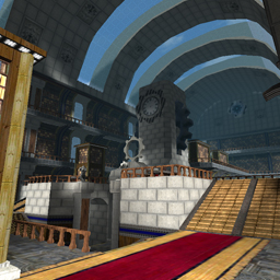
The map contains a lot of misaligned textures towards their geometry (as the e7beam02_blue on the beam and ik_wood_trimh64e in the bookcase shows in the 1st screenshot, while the e7beam01 looks bad on the arch which represents a lamp seen in the 2nd screenshot).
There is no proper textureset taken which can be clearly seen in both screenshots. The e7 texturepack is actually meant for more gothic themed maps; instead of an indoor plainly lighted library arena.
As we came to the point of lighting; I would recommend you to read the Basic Lighting Guide.
There is no need to use an ambient of 50 if you light properly.
The clipping. I'll use the 1st screenshot as a reference once more (although not being in edit-mode), some pillars aren't clipped at all (the pillar with that wooden plate inside of it), while others are overclipped (the pillars within the staircase). As it appears like the pillars within the staircase are completely noclipped; they actually aren't. Due this; people bump into them and probably get fragged if they were in the middle of their escape plan. So clip shit right.
Also adding a ceiling of clip right where a 2nd layer of balconies starts is a bad idea as it feels like you can easily grenade- or rocketjump towards it.
The placement of the bases is nearly good. They have plenty of entrances and exits while not being in contact with each other, except base 6 and base 3; which are only a hop away from each other.
The placement of playerstarts could be way better as they currently are very crowded towards the same area. It's a deathmatch and capture map; spread playerstarts!
Pickup placement is something which lacks the map as well; there is nothing on the higher floor at all.
Now the last thing; add at least 1 envmap entity. Even right in the centre of the map (with a radius of about 5000) would do. Seeing only some darkish blue below while more light aqua coloured blue above in the glass really stinks.
Well, that's it for now. It's a pretty good try and it seems like you really have thought about the flow. Next time; keep some more space to move around. Let other players first try out the flow if you're not sure about it.
I think if you would make the 1st floor more accessible (the balcony at the sides wider, less monotonous, etc) and the ground floor more open (less silly crates right in the middle of paths but more at the sides, etc), It could become more or less playable.
If you would fix all texture errors and the lighting, then it might even look nice as well.
I'll rate it 5/10 so far.
P.S.
A tree sticks right through one of the glass panels; looks quite odd.
1st screenshot:

2nd screenshot:

