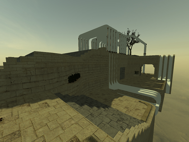
That there is a certain inactivity on providing content on Quadropolis doesn't justify the lack of a certain quality. It obviously doesn't need to look awesome, but it certainly should look finished (although it doesn't have to be finished yet).
The map lacks details and is textured pretty flat.
The flow can use some more effort also; you seriously can't see that some round plate covered with toilet tiles represents a jumppad. The position of that jumppad is highly annoying as well because it nearly forces you to use it when using that path. Let players choose and put it more towards the wall or rather towards the edge of the playground (so screw those rockets; let them be picked in air while taking the jumppad and move the vertical trim some cubes further away from the upper floors).
The map could use some more nature in it's theming. Perhaps than it looks way more polished (some more plants, grass, a waterfall, etc). For example, make a cave from that path which crosses the upper floor perpendicular from below. Let the map semi-represent a rock which has been build on. Add some fog, fogdome and clouds.
P.S.
Use anti-aliasing when making screenshots; the current one used on Quadropolis and even for ingame loading is very pixelated.