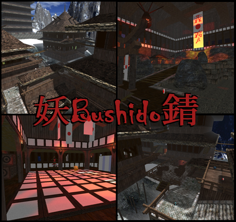
Raising the ambient to 70 isn't very good for the atmosphere. It looks like the map is shown in vertex rendering mode (a very bland appearance).
Once again, should this map contain that huge amount of triangles and vertices? I think not. It could be optimized way better as it is now. For example, the scrolls are placed very repetitive and they lose their magic as being a detail (while they only reduce the performance of the map). Delete at least half of them (which should make the bookcases less copy-pasted also). The outside of the map isn't that great addition to the map as well. It feels like it's placed there to "save the kittens", instead of actually being part of the play.
Once more, all I see is copy-paste. Perhaps you're working on it for a long time already, but why don't you spend just a little more to make the map appear more natural?
The texturing is odd; there is no snow on the roofs at all while there is on the ground. I've never seen that before, unless those buildings are being heated that good (but I doubt that because the only source of heat are some torches).
Once again, there are particles floating around with no torch at all as well.
I won't mention anything about flow or gameplay, as both points is something the map lacks (and I won't state it how to improve it again). My only advice on this would be to go on with the "shrine" (delete the rest) and make it more asymmetrical (less long stairs as well).
It's a nice theme and a good attempt, but there are just the common flaws again. Don't get me wrong and don't take it too personal, it's not a bad map as certain previous attempts. Have you actually tried to join a clan and get some input from them (mX, MH, etc)? Perhaps certain mapping clans could help.
