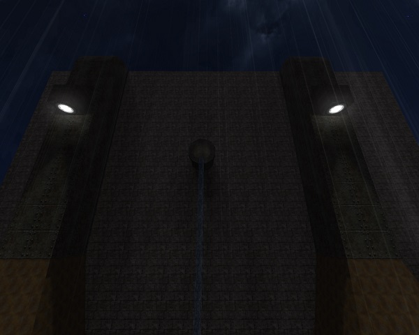
Saw you creating it but you didn't want any feedback :P.
Well, now its time to give some serious feedback.
layout
Well, yet it is rather bulky on some places, the thin walls make it look so unproportional.
You can still bump your head on a few positions.
You have very thin walls as already said; you should work on that. It makes it all look fragile and unreal.
I also can't emphasize enough that you should work "on the grid".
First of all: it is about mathematics. You can jump a specific height, run at a specific velocity, etc. gaps with a 5-sized cube is just about the right distance a player can safely jump. Creating other layout elements such as stairs, just go right with this size. To sum up this chapter: building on the grid saves you time to get a proper layout working without caring too much about the detail. You do not want to throw away a fully detailed and texturized work, so make sure that the layout works before getting on that.
Building on the grid also saves you WTR.
-source : Cube2Mapping - a Level Designers Guide
You already have 52K on the WTR(Poligon/Vertic/Triangle) count. This is a lot for a map of this size. without that much details.
This happens when you work with smaller cubes and they can't be fixed through /remip.
Optimizing this is very important.
As you can see here, 36 cubes on this side for a ramp. 1 Cube on the other.

Or here

Also for the slanted walls: some of them use up to 600 un-remipable cubes that could be done in 10 or less.
Break it up
You missed the opportunity to break through a few walls that would add awesome flow and more ways to it.

Thats even a trickjump in one direction ;)
OR, you could add some open windows, that you are not this isolated in this labyrinth-type map.

Anyways; mazemaps, that have no focus in the middle, are not my type of maps. You need some time to get used to the layout, if there is no significant shape or look to each area.
It is therefore a bit harder to make it good than an open arena map.
Rule of thumb: connect as many hallways as possible and make it as open as possible, even with a maze-like layout.
There are a few unnecesary box-shaped halls that do not necessarily need the extra room. In other words, there are sometimes boring platforms with no special use.
Maybe something else that is important: make different positions in the map useful. you already did a nice aproach on the sewers, people can always ambush you from behind, but at least you get a quad dmg. (at least in non-insta matches)
There are some one-ways in there, long hallways without any other way out.
Theme
I won't rate it yet, but mixing lunaran with these bricks doesn't work out that well.
Try to mix other similar texturepacks or at least brick walls with a similar shader.
As already said before: try to make significant rooms that differ from each other so you get used to the layout easily as player.
Is is part of a dam? Add some terrain. Is it some kind of industry workplace or factory? add these kind of details.
You can also substitude some of your walls with rocks, depending on the rest of the theme.
Immerse the player, that he believes in the environment you build there.
Create fake doors, so it is not a closed complex. These little details can add a lot of variety to your layout.
Also try to add different high walls, all of your walls with the water on top of it are the same height. Changing them adds some variety.
For any further guidance or feedback I'd love to point out the things ingame if you like.
