Hello Pritchard!
It's a good start. Some hints:
Layout:
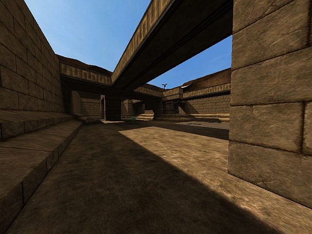
The layout is very simple, but it does it's job so far. It's very flat though. What about altering the height a little bit in some places? Not much, just a simple jump higher or lower.
Item Placement:
I like the idea of having just one rocketlauncher and just a green armour. The placement could be more efficient though. Who would run to that corner just to pick up some shells? Difficult to explain, I could show you ingame.
Lights:
Again, simple, but effective. Two suggestions: Try, how slightly (!) different colour values would work. Plain white looks a bit boring to me. Ever tried to rotate the sun and the sunlight a little? Maybe the shadows could look more interesting that way.
Textures:
I generally hate that brown rock texture. It is used in almost every map now and just looks like crap. So I am not a big fan of your background, too. But that is probably just my personal taste. Besides that the texturing is ok, yet still pretty basic. What about using a trim texture at the very bottom of the walls? Would make sense to me and would underline the architecture there. The roof looks odd with that brick texture. Either choose some floor texture or skytexture it. Players wont see it anyway.
Details:
Good job on textureblending. That could be done in a more accentuated way by using a not so dark sand texture (nieb texture on page 8 maybe). So there would be more contrast. You already pushed down some of the tiles in the floor, which has a good effect. Why not break out some of those tiles totally and lean them against the walls or break them into two or three pieces? You could also break out/push back some of the bricks in the walls.
Keep up the good work!
4/10 so far!
Greetings
rabe
---
Rabe's Map Storage
