Thanks for the feedback, I appreciate it!
A lot of it makes sense; some I actually disagree with.
But let's start with the positives:
The gameplay is quite bad in general actually. [...]
So the map could work for an all vs all deathmatch, but it tends fail at any other mode.
Yes, item placement was done in a not well thought-through way, I'll have another look into that. The flags I can try to rework as well, though it might take some time.
But there is a clipped ground area under a building near the blue base wich really let us fly. That should be fixed.. Dunno why you build that strange structure.. there could have been just rocks without any clip..
Duly noted, thanks.
Why is there a ceiling of clip in the cave where a flag and a base is located? Another clipping fault is the upper window of the tallest tower; you are able to get inside the building (while there is nothing to do there). Be sure to check out more of such errors as I'm sure there are more of them.
Ditto.
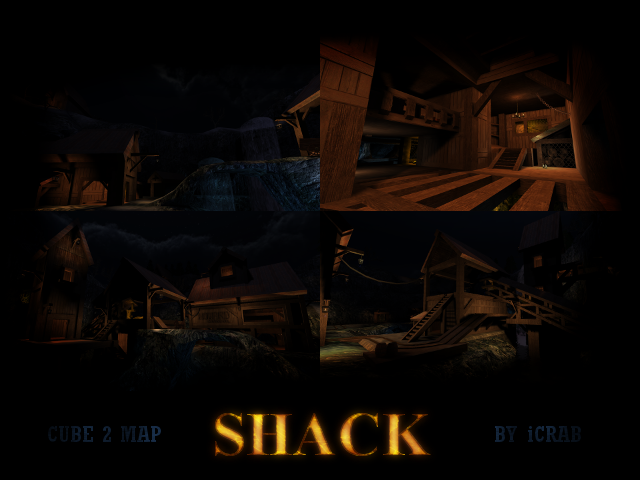
The texturing in overall is fine, but the techniques seems to fail. For example, the snow could be blended harder to flow better from rock to the actual pieces of geometry covered by a snow texture. The contrast between brown and grey seems to be quite subtle.
I made some blendmapping errors in general, because I simply forgot how it works. But Snowy gave me some healthy advice after the upload.
---
Now, onto the stuff I'd like to discuss, which mainly concerns lighting.
In retrospect I realize that some areas and corners are too dark. But does ambient really fix that?
Personally, I strongly dislike the ambient variable, because it doesn't provide a solution, but is a very cheap way of doing things. Why is it that in real life you can see almost everything, even in the dark? It's because light is reflected from pretty much every surface. Sauerbraten doesn't do that (from what I've seen that's something they've fixed in Tesseract?), so there's this arbitrary ambient thing, which is even more unrealistic than having no light at all.
Why? Because if I set ambient to, say, 12, none of the atmospheric surrounding light is transferred to that area, but a plain gray (that is to say colorless). I experimented a bit with this, and every time I turn it up, everything looks infinitely more ugly.
So, for instance in the cave which I'd like to have mainly a sort of blue ambience, suddenly some gray rocks pop up. It ruins the immersion. I'm very much convinced that the ambient variable will solve nothing and I intend to avoid it entirely for the time being (wish I could've set it to zero even).
The solution I currently favor is adding more subtle light sources emulating natural light reflection. I'll reduce (i.e. eliminate) the dark corners, trust me. Just not by using ambient.
First of all, add the sunlight. Even a cloudy nightsky casts some lights on the ground but you have a full moon.. even if you made it look darker it should give a lot of light to the village.
I did use a light (because the last version I mapped in was justice) and it basically does the same as sunlight. I guess you haven't found it (because it's wayyyy up there), but to me it does the job. Maybe the angle could be different.
And now the second issue: Realism.
I wasn't shooting for gritty realism in this map and I never thought Sauerbraten was the place for applying photorealistic texture work. Granted, I can tear up the tracks or the wood here and there, but too much of it will look pretentious and even less authentic on such a (pardon me) dated texture resolution.
Perhaps the term you are looking for is indeed "authenticity" and I'd concur. Some stuff does look a bit plain. I'm sure we can find a compromise. But I'll keep the wear-and-tear to a minimum.
As for the ore emitting light, I'd like to keep it that way. Logic and realism aside, imagine this map for a second without the yellow contrast lighting and you'll concede that it would look really dull (also I never said this was gold :P). Sui, can you tell me what exactly you mean by "done right"? What techniques do you suggest?
Same for the ambient blue lighting: I just wanted the rocks to have that particular tint inside the caves. Does there have to be a light source for every light? I can give plenty of valid game design examples where that is not the case and serves the overall look. In some games the ore even sparkles randomly; is it realistic? Of course not, but it just looks nicer.
In a nutshell, some of these decisions have been made deliberately to serve the theme of the map. And I believe this is the first time I've ever heard the term "realism" in conjunction with a Sauerbraten map. ;)
As I do the majority of my mapping during Uni lectures where I have no stable internet connection, I can only upload stuff on weekends; regrettably coop editing will be near impossible.
