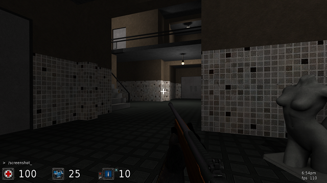
After downloading the map and navigating through it I've noticed the next couple of things;
Content
The packaging is excellent, nothing to complain about that. However (as Zoocata stated), the screenshot could show off some more dimensions than just 1 look at other nodes (which contain maps) how they did so. There's even a section described about it in the packaging guide right here.
There actually is a section to upload your map right before the url-link (use the url-link whenever your map is bigger then about 9Mb or have preferences on that). The attachment-section of a node is actually meant for content which is additional towards the primary content (like the map in this case). So like an old version of the map.
Theme
The theme might not be so original (as it's a remake), yet it actually is for Sauerbraten. However, the theming could be expressed better by using more textures, details and so.
Texturing
The texturing in overall isn't bad. Some more texture techniques could have been used (perhaps that's too advanced as you're still a newcomer, I'll still would advice it because it could really create a good atmosphere to use some texture-blended blood or dirt and some custom shader settings towards the bathrooms for example).
I'm not a huge fan of the floor textures which have been used, but the walls look pretty good.
Geometry
Perhaps you don't know how Cube Engine 2 actually renders your map, but I'll try to explain the basics;
Cube Engine 2 loads any geometry within sight, but also a (rough) part of the (predicted) next sight-scene. As the boundaries of your map are walls of 1 cube as well, Cube Engine 2 might render the other side of the walls as well. So in performance, this actually would slow you down when rendering any frame (as it has 2 sides to draw instead of just 1). Take a good look at official maps like metl4, ot, turbine, mbt10, etc; all of their boundary walls have no actual outside face (as you wouldn't be able to see anyway when running around the map). Try to do this as well.
It also saves up a lot of file-size as lighting won't be calculated over geometry which isn't existing (how obvious).
Lighting
I noticed some lights not having a light-source and light-sources not having (enough) light. What about fixing that? There is such example in the chicane somewhere throughout the map.
Details
You can still add way more details to make the map feel really base-like. So far it's still a lot of hallways which are connected to each other while just being (nearly) empty.
Flow
I'm not a huge fan of using noclip on closed doors, as they should be closed for a reason. So I would advice to put certain doors open and others just only a bit (like an angle of 45°). Perhaps some doors are just trashed out of their hinges and are just dropped next to the doorway.
There are also quite a lot dead ends - please don't (even if GoldenEye had them).
Gameplay
Use the command entselsnap 1 (default 0) to lead entity via the grid instead of just free floating around. This way you can put entities with a way higher accuracy.
Don't place several of the same ammo close to each other. Spread it around the map instead for much more fun among players.
Overall
I could tell way more suggestions/advices than just this, but let's try out so firs. I'll rate the map 5/10 so far, as it's not that bad, but still needs to be polished.
