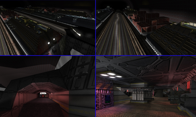
[++] Concept
I like the overall feel of this map, you really made it seem like you're actually moving along with these massive vehicles.
The sounds and the lighting are done in a competent way and help the atmosphere a lot.
[ ] Layout
Mediocre at best. There definitely is too much linearity and navigating these things becomes tedious and unsatisfactory after a while, because you don't have more than 1 general route to take between the trains.
[-] Geometry
I must concur with the others, it's really not very pleasant to walk through this map; getting stuck or missing a narrow walkway is too frequent. Surprisingly, the cargo areas (which I instantly frowned upon, because box spam usually destroys gameplay) were all right, but only on top. I imagine inexperienced players to have a lot of difficulty with this map.
[+] Overall design
Some nice ideas; I like the tanks and some machinery. It definitely shows you wanted to include more than just arbitrary structures.
The brush-modelling is also nice, definitely adds a lot of soul to this map.
[--] Texturing
Oh my. Please start practicing proper texture alignment. It seems like for most areas you simply selected the cubes and slapped more or less random textures on there (within the set, fortunately), but also some choices really break up the already fairly cripppled visual impression of this piece. What I will say is that the bases and the areas where you showcase some fairly nice brush-modelling look best (although the no camping sign is a nice gimmick, it doesn't fit at all, aesthetically).
The blendmap stripe on the tracks, not sure what's up with that. As it remains static, it kinda destroys the sense of movement if you look too closely.
All in all, the farther you zoom out / walk away from something, the better it looks. But that's to be expected, generally. :)
[+] Lighting, sounds
Nothing to complain about. I really like the headlights and the sound design. Bravo. (I mean, there are some odd light placements, but I can forgive a lot of that if it's functional.)
[?] Item placement
I only care about InstaCTF, so I didn't look into that.
[ ] Overall
I do think Sauerbraten could use maps like these; unfortunately the execution leaves much to be desired. It seems like you focused more on the brush-modelling for people to look at. However, most of that stuff is inside and I only found most of it by accident and what people will see first and will ultimately be annoyed by is the map geometry in general (and random textures).
Then again, I don't really know how much mapping experience you have, so if this is one of your first projects, a big thumbs up!
I'll give 5/10. "Compelling" is exactly what I'd call it, no more, no less. It has potential.
