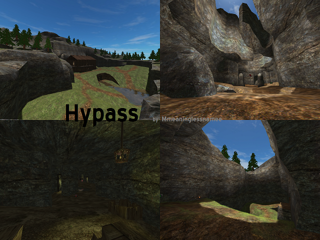
Just looked at the map (havent looked at any other versions):
Lighting
The lighting on this map seem super over bright. Meaning that there is not much variation in lights and darks. I think that the ambient light is far too high, and you should use sectionalize lights (in the tunnels) rather than changing the overall ambience. I would set the ambience down to about 10 10 10, then go in and change your lights (in the tunnels) to have a much larger radius (like 300-500). Then add in ambient lights about 200-300 units out from the lights in the given direction, as half lights (lights with 1/2 of the r g b value (r*=0.5 g*=0.5 b*=0.5 ) and a radius of 200 - 400, with the last variable set to 0 [ie newent light 200 40 35 20 1] creating a light that doesnt cast a shadow). Then i would add 1/4 lights in as needed to vary up the darkness.
As for your light color choice, you have way too much values in your light, i would nv set a light (especially a non sun light) above 200. This addes to the over bright look, and really makes everything look white, and flat. I would change it to 170 160 50 (r g b). Also i would vary up the number a lil on a per light basis. Because relistically not all lights shine the same, especially when the light source is a candle or torch etc. Also adding 4 small lights under the light is not necessary, if you place your light correctly you should be able to use 2 lights to create the same effect (one with the 200-400 radius, and one with a 100-200 radius (above and below the light)).
I would also add in torches along the walls in between the hanging lanterns to allow for more light variety. you can get away with using a more red (orange) valued light something like 170 130 50 (ofc you should experiment to see what works best). Also you could add blue and/or green crystal clusters along the walls and ceilings for even more light variety, this will give more detail to your map as well.
Detailing
The detailing on the map is poor, this maybe made more obvious by the flat lighting scheme but is still a problem in and of itself. For example the valleys on at either fort are very empty, adding land variety (rocks, stones, trees shrooms, etc) could remedy this easily. Plus game play wise this is a sniping haven, adding such things would at least give other players a chance, and make snipping take some skill ;)
Also the caves feel repetitive, i suggest taking the gray rock texture and blendmaping it with another rock texture, (maybe more than just one) and using blend maps to break up this textures monotony. This could be done through out the map. Also the grass should be blended with another texture other than just the dirt, (maybe a stone/dirt texture or another grass texture [maybe dead grass]), to add more variety. It looks very tiled (where the textures can be seen to repeat over and over).
The Rocks in the map (for the most part) look like they were lazily height mapped in. I suggest taking some of the blocky areas (around the corners) and add in some variety and smooth them out. Also adding a wooden trim along the texture seam of the base wood houses, so that the texture seam is not exposed would be nice :)
Your base cabins look like stables/barns, but lack any of the functionality of such maybe adding in some barn doors :) or something to sell this and to break up the wood texture monotonic nightmare.
Environment
I think adding a fog in this map would be good, along with some light clouds. I have not really experiment on this, and it would loosely depend on how you lit this map, but i do belief it would help finish the look.
Also a small nitpick: technically if this water is running through the caves, it would pick up all the dirt mud etc from the bottom of the cave so it would be very foggy and very brown ;)
chasester
Ps: there is much more to be said, but those are the obvious problems that need fixed first :)
