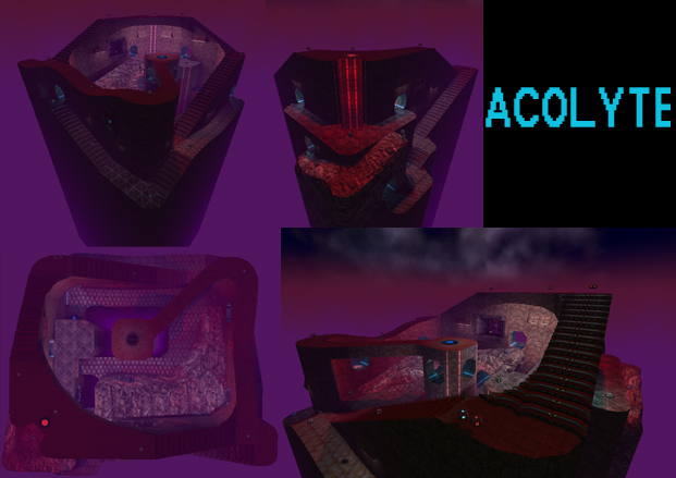
I only just downloaded this, I will have a critique shortly. I'm excited that this map doesn't seem to be symmetrical.
On a random other note, I've played through Warzone part 2 and should give my thoughts about that too, but I have lots of things to do.
EDIT:
Nevermind, I don't have much to elaborate on with this map, but here's a few points.
-Everything is incredibly narrow.
-With lots of low ceilings. These two factors combined means that in many areas of the map you have effectively zero evasion ability.
-You can fall down the hole behind the green armor and get stuck.
-The red and purple color scheme hurts my eyes, though that may be more of an issue of me being tired.
-The yellow armor spot is interesting, but that about the only interesting instance in the map. Like suicizer said, a lot of the map is stairs. While I don't care about player's aim being perfect, it is really boring gameplay to have lots of stairs, unless they add some dynamic central to the map design. (I'm thinking of the map in Cube 1 "HellGate" that I like) (Actually, mbt9 is a much better and more recent example of lots of stairs that work.)
I think I liked the map better when I copied and doubled the size of it.
I hope I like the revised edition better.
