I was wondering how to spend some time, and Lo!, here are two more maps to review. This will all be written as I play the map and notice things, which is how I've ended up review just about every map for a while now. :/
Even before playing the maps, I've noticed that your folders don't seem very effecient. Do you really need separate model folders for each version of the map. There also seems to be overlap in the models themselves in the two folders. It may make it easier for you making the map, but it just wastes space on everyone else's computers.
---
FFA:
---
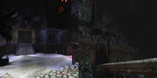
-My first spawn was in a nook up in the wall looking out at snow through the mouth of a vicious-looking statue. Nice spawn point, both visually and tactically.
Actually, I can tell a couple other things without moving from just this spot as well. It looks like you’ve used height better than many of your previous maps.
-The next thing I noticed is that unfortunately this map seems to be perfectly symmetrical. I really don’t have much more to say about this map because of that. Symmetrical just doesn’t really work that well for FFA maps. I’d suggest that you keep one half of the map, but completely rebuild the other half. (I feel this really is necessary to make this a good map. I like most other things about it, but there really needs to be more to it. Not bigger necessarily, just not so predictable or whatever. I cannot think of a single MultiPlayer map you’ve made that isn’t symmetrical. (granted, they were quite often CTF, but not even CTF has to be symmetrical)(oh, that snowy one from Warzone pt.1 wasn’t symmetrical))
-oops, that’s just lava, not a jumppad over lava!
-I like those flaming-eyed skulls.
-interesting quaddamage spot.
-You might want to cut down on the lava-fall decorations. They’re okay as a detail, but really overused. The other details are okay if you redo half the map because then they won’t be reused in the same spots.
-The themeing and lighting seem fine to me. If someone else wants to nitpick that they can.
-as for weapon placement, you should redo it when you redo half the map. I have really nothing to say about it as-is, it seems serviceable. All the health near the center seems okay, but you might want to cut it to just two instead of four.
---
CTF:
---
-Okay, this reuses a lot of the FFA map, though that’s not bad.
-It’s awkward to try to jump into the nook to get the flag. While that may be an intended defensive measure, it seems annoying and unnecessary. You shouldn’t have to jump twice while completely exposed to get it. (though you only have to jump once with even a pistolboost)(nevermind, you can get there with just a regular jump, it’s just hard.
-Ooh, the lower path is nice and menacing, and I’ll forgive the complete lack of cover, because it’s a fast path so it needs to be dangerous.
-I like the sideways windblown snow particles. However, some of them emerge from walls, you should fix this.
-IMO the wind sound should only play in the middle of the map, and IMO it is much too loud, even at half the default sound volume.
-Put the deathclip lower down. It doesn’t make sense that you die where you do.
-put a different texture under the jawbone at the flag (on the FFA map too) You see the ground through it, and it looks weird.
-The layout of this map is basically straight lines. I don’t have any specific suggestions, but it would be nice with a few more bends and twists to provide some interesting gameplay. A general suggestion would be to put more space between the center bridges and the flag courtyards to add some more passages that are more than just straight lines.
-Also, what I said before about the overused lava details can be said again here.
I think that’s enough for now, this is at about two pages in Microsoft Word so far.
TL;DR
5/10 for FFA because I think you should redo half the map, 6/10 for CTF, mostly on the visuals, because the gameplay’s below average. 6/10 overall for this content node.
