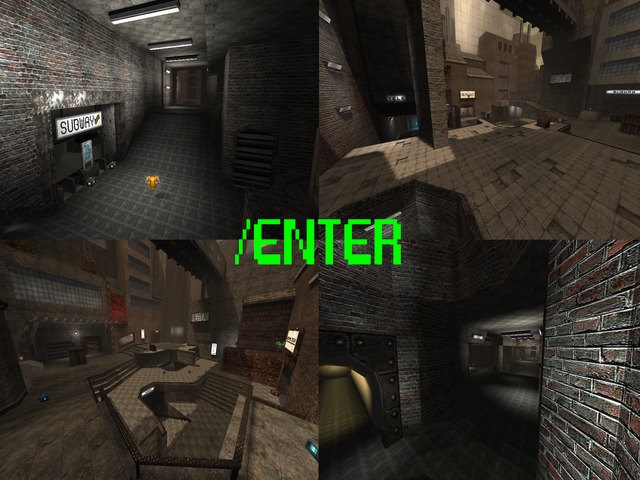
Ok, now let's write a proper comment...
Content
The screenshot seemed fine from the beginning of the node, while the packaging has been improved (good job).
Nice side information about the gameplay of the map.
Theme
The map looks very much like industry (same theming, textureset, even the flow is similar), yet it lacks a lot of things which makes that map original and truly finished.
Texturing
As I previously said, the texturing is still very basic. A lot of ceilings are the very same bricks as the walltextures are (I've actually never seen bricks being positioned like that in real life which makes it feel quite odd).
Also using the 4_met01 as trim looks pretty weird, as it is originally a plate texture which is being cut in half right now.
I'm sure you could pick a way more fitting texture than the cheap looking 3m_metflr_tiles, as it feels like it has been painted onto the surface instead of really bolted, screwed or even welded.
The map could use some textureblending also.
Geometry
The ammount of wtr has been kept low everywhere, but seems just a little too low. A lot of trimmings are diagonal a lot thinner as they are horizontal or vertical (which doesn't seems to be done on purpose). I know it's called Cube Engine (2), but that doesn't mean you could make it a little bit more round than just square or diamond shaped (as the huge pit for example).
Lighting
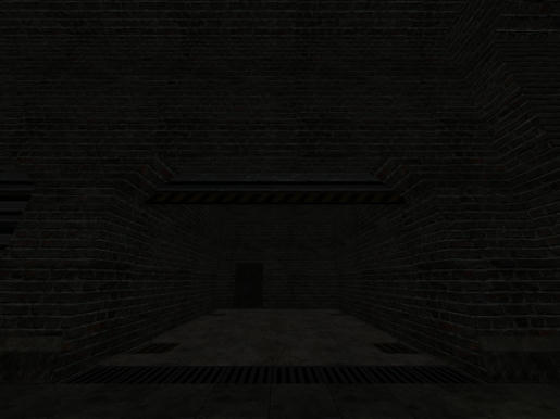
As previously said, the lighting has been kept pretty basic. You can see certain areas by the continues used lamps, but areas which have certain details as like boxes and so actually aren't lighted.
To me, it has been kept too basic actually. The unlighted areas doesn't feel like they should be dark as a quite large lamp is emiting right at the described walls/ceilings. Ever thought about using spotlights or even just the usual lighting technique; 1 bright light-entity with a small radius close to the light-source and 1 weaker light-entity with a large radius some cubes further away from the light-source. See maps like metl4, ot, turbine, complex, outpost, etc?
There are also rooms which feel like they miss some lighting, as being shown in the next screenshot.
Detailing
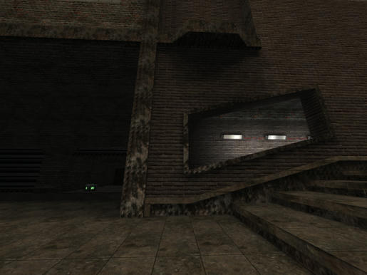
There are several details which I forgot to mention (the subway signs for example, nice to see them), but they are very concentrated. They only do their job right on that spot, but that's it. That's why I would suggest to add more trimmings and decoration on walls, floors and even ceilings. And let them pop out instead of hiding them with a similar coloured texture as the surface which they are attached to.
Clipping
Everything has been said about this already, nothing to mention.
Flow
The flow seems like finished, but guess again; it's not. There are still certain doorways which you bump your head against while jumping. The details of the jumppads doesn't seem very clear as an actual jumppad to me. It feels like it's missing particles or even just some light (I would advice both).
Gameplay
There are still 9 health spawning around the map (which are all located relatively close to each other as they nearly are always in pairs) and nearby armour, which makes it very hard to kill an opponent. Keep in mind that there should be just enough health and armour so people go (desperately) search for them, while they still are stacked with ammunition to deal damage to an opponent. This creates a way more competitive and flowing play than when players are full of health (nearly) all the time while trying to kill each other with a pistol and searching for ammo.
That's why I suggest to limit the healths to 3 or 4, delete the healthboost, add more grenades (1 is really far too low), replace 1 bullets for a cartridge or shells, add 2 riflerounds.
Try to distance the health and armour also, as now you can regenerate back to full health and armour in a very few seconds when being damaged (so delete those health at the stairs nearby the YA).
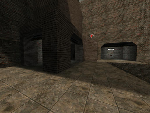
I'm also not very font of pickups which float very high above the ground, especially when they block your view (like the YA, GA and some more on the open field). Try to keep them as low as possible, but they don't really have to touch the ground as well (the best height often is when the boundingbox of the pickup touch the ground).
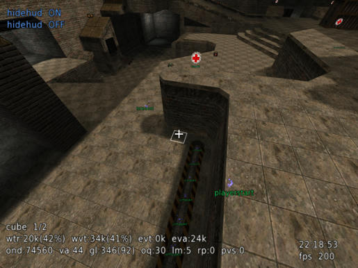
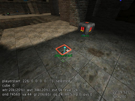
I have several screenshot of playerstart and teldests which have been truly odd placed. Please fix them by offsetting those a few cubes from an edge and an other direction also (like not facing a wall for example).
There have been no waypoins added so far, too bad.
It feels like the map could use some bases for capture, although the main floor should be way more closed for that actually (as in providing cover).
Overall
It looks like this map is somewhere between the stage that is done with the actual layout, but just started texturing/adding details about 2 to 4 hours ago. If I really would rate it, I couldn't give it more than 4 points so far.
P.S.
Now stop acting like you aren't getting enough attention as this is the most attention I can offer to your map =P!
