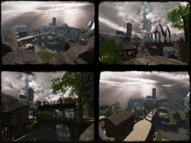
Content
Interesting story about the map, quite original. Still couldn't find a lot which actually fits to that story though.
The screenshot and packaging seems fine, except the naming is horrible. Please don't use "." inside a name of a map, as they carry no real goal (you could also name it just v0101v.1.1, not v1.1). Also don't use UPPERCASE symbols, as your map isn't anything more special as other maps (nothing personal, but it just is) and only takes more time to write on OS which makes difference between uppercase and lowercase.
Theme
Quite original theming. I think it kind of fits in the same place as eternal_valley, skycastle, fanatic_caves, etc.
Already said so; there still should be a lot more than just some nice lookig details to show off the real theming (which is a pretty competitive if you ask me).
Texturing
I've noticed you've used some textureblending on the grassy planes and on top of the mountains; nice work, it looks realistic. Although you forgot to do the very same in the caves (it looks very grey right now, what about some small contrast?).
Having just pitch-black walls that are supposed to be teleports aren't very convincing to me actually. What about some particles which makes you feel that you really want to use them?
Geometry
If this really is going to be a playable map, I would advice you to keep the wtr as low as possible and not continue in the same style as most of the bridges are made (which use a lot of wtr compared to other brushes).
Lighting
The lighting isn't bad so far. It's has been kept just basic.
Detailing
There are still a lot of rooms which are just empty. What about using some mapmodels to fill the place up a little? There are beautifull mapmodels nowadays which would fit the theme very well.
It seems like you have forgotten about particles and sounds. They can add a lot of reality and increase the experience of a good walk through the map for players (for example, at the waterfall).
Clipping/Noclipping
Haven't checked out that very well, but couldn't find anything odd. Except the fact that you are being stopped at the wooden crane in and above the water for no actual reason. This feels kind of awkward.
Flow
Not a bad flow, but not that great also. There are certain levels of areas around the map, but you still get stuck at doorways when jumping around in certain houses. I'm not quite sure if it would be equal for both teams as well. Then again, there are no flags yet.
Gameplay
Not much to say about this. It still lacks everything to make it a good ctf map.
Overall
There still needs to be done a lot of work. I can't actualy rate it on it's current state.
