Hello rudi!
Nice to see some of your work here on quadropolis.
It would be nice to have some description of the map and its purpose: why did you design stuff the way you designed it. It's always hard to give feedback without knowing, what you are aiming at.
Some points in addition to what suicizer already said:
Theme/Texturing:
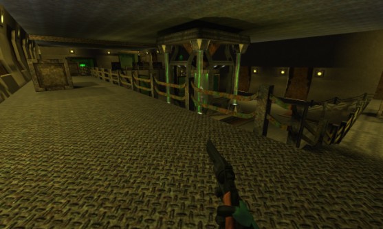
The textures do not really go well together: wood-textures, trak5-surfaces and textures with an industrial theme won't create a logical theme, when put together this way. Some textures are not aligned properly or do not fit the space/surface, they cover; e.g. the sides of the floor trims or that computer thingy at the wall (lunaran/qcomp4_d). (Side note: the glass surfaces reflect the sky, which is illogical, since the sky isn't visible itself at all.)
Light:
Good to see, that you choose not to use only white lights. On the other hand, there are a lot of light sources without light entities and vice versa - totally no-go in my opinion, because it is illogical and unrealistic.
Details:
There are hardly any details, just inside those glass boxes. The aesthetics of a map should be balanced as well as the layout. It just looks odd to have totally plain walls, ceilings and floors going along with detailed objects here and there. It feels like a museum with those glass-boxes.
Before starting a map it is a good idea to make a kit/modules, which then can be used/combined as details (pipes, trims, crates, doors, windows, vents, lamps, cables and so on). Check out Joel Burgess' Article: http://www.gamasutra.com/blogs/JoelBurgess/20130501/191514/.
Layout/Gameplay:
I do not often play capture and hardly have any expierience in it, but the excessive use of dead ends in this map seems suspicious to me: I cannot imagine fun gameplay in these areas. Also get some pickups for other gametypes in there.
To sum it up: solid start, but still a lot of work.
