Hello Pyccna!
As already said by Mmeaninglez, this seems to be an interesting, yet unique map. There are a lot of things, that could be improved though.
Lightning:
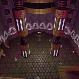
You wrote, that it should look "dark & mysterious", but it does not look like that at all. It rather looks more like a disco and the light is very repetitive. There are also a lot of light-textures, which do not emit light at all: that looks odd.
I would suggest to set ambient to 0 (or very low). Using textures like "lunaran/light_fluoro_1d", you should put 4 small lights (newent light 15 r g b) along the texture and one bigger light (newent light 100 r g b) a little further away. This way you get a better contrast (and it looks more realistic).
In general I would suggest reading through Hourences' lightning tutorial (http://www.moddb.com/tutorials/lighting-in-game-environments-the-hows-and-whys).
Textures:
I like the effect, the purple lights have on the lunaran textures. You also seem to know how to apply/adjust textures. Some places look very boring though, especially the large/high walls. Maybe you could try to make them look more interesting by adding some horizontal levels or adding more depth (some rooms behing glass or fences). This also applies to the floor.
Architecture/Flow:
I like the basic layout. It could be greatly improved/tuned though. The way it is now, it is unbalanced: very large rooms & very cramped/small rooms put together. Maybe you would try to scale up the smaller rooms to make it all fit together better.
Gameplay:
I do not understand much about ctf, but what Mmeaninglez said about the one way doors sounds convincing.
Item Placement:
I did not check it all yet, but the yellow armours places just feel annoying.
EDIT:
I forgot to mention, that the sounds are annoying. They fit the atmosphere, but use a smaller and fading radius and assign them to some logical source (a computer or tele).
