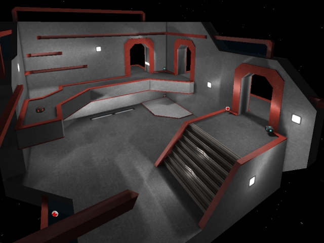
Let's see, you got the packaging right, but the map picture should be a .JPG instead of a .PNG
-the clipping near the yellow armor isn't very good. There's a tiny narrow ledge left unclipped you can get on for no apparent reason
-The jumppad should probably be a little bit stronger, like 20 or 21
-If you're going to clip part of the top, you might as well clip up a long way, because if players weaponjump up to the top and walk on the clipped parts it seems weird. Or remove the clipping there entirely, or change the geometry so that there is a visible barrier preventing players from accessing the top normally.
Pickups:
I'm not that good with pickups, but having 5 health and an armor all in the upper corner of the map is completely unbalanced.
There's far too many health pickups overall, especially compared to the number of weapons. The number of weapons itself is probably okay for such a small map.
You can get to the yellow armor with just a pistoljump, I don't know if that's intended or not. However, because of this my suggestion would be to remove both health by the upper rifle pickup, as well as both the other double health. Replace the yellow armor with green, and the green armor with a health pickup. Replace the health above the healthboost with a weapon, put just health or nothing at all where the boost is. I'd either remove the boost entirely or put it at the very top of the map so players have to grenadejump to get it.
The main problem people will have with the light is that it is all completely white.
Also, there are lots of low ledges and doors that you hit your head on/run into while jumping. I personally don't care about the doors, but most others don't like that. The ledge in the main area should probably be thinner to give more headroom though.
Others will probably point out some things I missed. (For instance, I didn't really look at the flow or detailing at all.)
