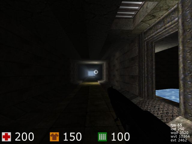
This map large, very large, and boring. Most of the map if made of narrow corridors. Sometimes there are doors leading to... 1) a room, 2) another narrow corridor. And all doors are small (and very easy to miss).
Most rooms (except the middle one) have only one exit.
Once, when I was at middle room, I was moving around and could not exit it! Why? Just because I missed the exit!
Most of the time you will have this view of the map (link to screenshot). In words, you will se a long, long and narrow corridor.
I played this map once in multiplayer. Oh... it was boring... Most of time we were trying to find other players...
Another problem: playerstart points are facing to walls. So, when I respawn, I need to turn around to have an idea about where I am.
One more thing: when mapping, keep things on grid. I saw a lot of odd-positioned things (like walls 3 or 5 cubes away from blue lines). Where you place things make a lot of difference for Cube Engine. RTFM to understand why. For the exact same reason, you should avoid 1-cube-width walls.
I think you might want to read this article from makkE.
As makkE said in his comment, you should use "solid cubes" (key F) to make walls, and not just raise them. After some small changes on your map, I managed to lower "wqd" count by half in most places. My modified version is found here: http://rapidshare.de/files/2581627/thetunnel2.cgz.html The changes are:
- Most corridors had a (useless) 1-cube-width non-solid "wall" at side. I changed all of them to "filled". This reduced "wqd" of corridors by half.
- Center room had a "wqd" count of about 4000. That room does not have any details, this high "wqd" value is not acceptable. The center wall was placed 3 or 5 cubes from blue lines (IOW, completely out of the grid, needlessly). So I moved the center wall and one of the side walls to be aligned to a 2-cube grid. This reduced "wqd" count to about 2000. The better would be aligning all walls to blue lines, but this will require to move many items and lights. This is a work for Acieeed, not me! :)
The good things of this map: creativity, nice combination of textures and lighting.
