First Impressions:
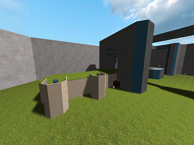
Starting with the worst, the geometry/detail on this map doesn't get better than on your screenshot. I'd suggest actually looking at other maps in game, I know no good map that is as simplistic/(ugly) as yours that is in sauerbraten at this time.
You don't need to smoothen the edges out if you don't want to (even if it might work, but please add more than the very few textures you have here to the map. The map's textures are as following:
Grass everywhere when possible.
Plain light gray texture on almost all walls, sometimes "Justice", sometimes not.
A few colors to indentify the teambase.
Unfitting stone texture on some floors.
Done.
Lighting very plain, very few lights, most light provided by sun, this could have been ok (most times it's not) if there would be more detail in this map.
Didn't look too much into the layout or balance, I just couldn't be bothered to stay very long on this map. :( (first impressions of these two: might be ok)
Honestly, even if no final product, this product seems to be not even slightly releasable, It'd judge it bad for a prototype just because of the (nonexistent) visual quality. Go fix that, and it _might_ turn out alright.
Also looks like not much time went into this, or(and) not much skill was applied.
