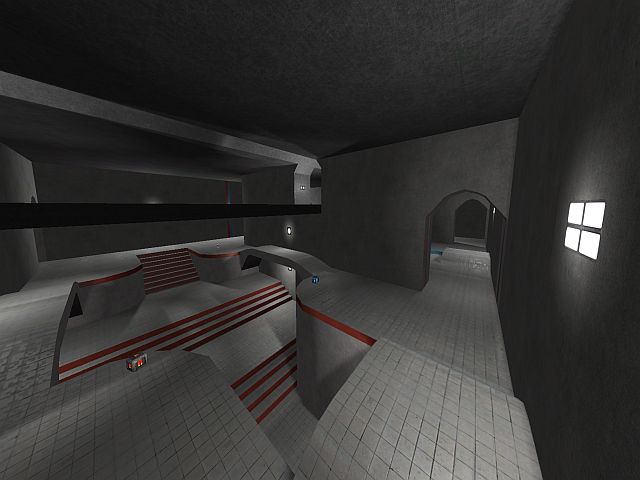
Well, let's throw some pennies in the box, shall we?
content
As someone else already stated, the packaging is fine, nothing to say about.
The screenshot also shows off enough to imagine how the map looks like, good job.
theme
The theme seems to be pro-base like, as the red and blue trims, the concrete and the clean geometry show off. Yet I think you could do better by adding more trims like that around the map (putting them horizontal often works out better than vertical on an empty wall).
texturing
You've made the basic of the texturing on the map, now let's put some contrast in it. As I already stated, try to enhance the plain walls by adding trims and so. Also taking a different texture for doorways makes it even more clear that there's a doorway over there.
geometry
It seems like you know a bit of the basics already, so let's take a step higher. You've made some curves in the doorways and under certain platforms, but they aren't quite fitting the rest of the geometry. Now I leave you a choice; make it straight, but diagonal and with a certain trim, or make it even more curvy by continue the curve instead of cutting them off.
detailing
You've managed to basically texture the map. now it seems time to talk about details a little.
I would advise to keep it pretty simple and not to use a lot of fancy details on the walls. Rather add boxes, a fence inside the wall (a mapmodel could be used for that) and some pillars sticking out of the wall (like the horizontal one in the map justice but then more simplified and putted vertical instead) are examples.
lighting
It's nice to see you get the idea that where ever is a light-source, the should also be a light-entity (and vice versa). I would change the lighting ad last part of all improvements.
clipping
The clipping/noclipping isnt necessary yet due the reason it has almost nothing to clip so.
flow
As you already have been stating on IRC, it won't stay symmetric and that's good as deathmatch maps shouldn't be that (kills realism and creates a confusing situation). You also stated that you'll higher the ceilings and certain doorways. I'm looking forward to see so and would advise you to do this as very first improvement as the layout needs to be done first before you could proceed to anything else.
I would also make the main floor less flat by adding certain layers of platforms in it or piles of boxes which are placed subtle.
gameplay
I see you've tried to add some pickups in the map and must say, it's not that bad attempt. However, I wouldn't place 2 GA like that because you can see in a split second whenever the opponent also took that GA when you are taking one. So I would advise to place one somewhere else on the map.
