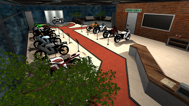
Nice to see some artistic map, but the details which really matters have just been copy-pasted several times and then retextured (as the bike is).
Seems like you forgot to use texscale at the mirror which stands next to the white bike that is positioned on some platform?
The white bike on that platform still have some texturemistake at the seat. The snow7 texture which is in the tomek folder is sticking out from the seat, while the rest of the motors (and the other side of the motor) isn't having that.
The cloudcolor isn't appearing to fit the skybox at all. What about setting it some darker?
I expected more than just this actually (in overall), but I like the bike. I definitely wouldn't give 10/10 to the content, because I've seen you making way better things than some motor shop (and also better things in general, when I only have to judge on details). 7/10 so far.
