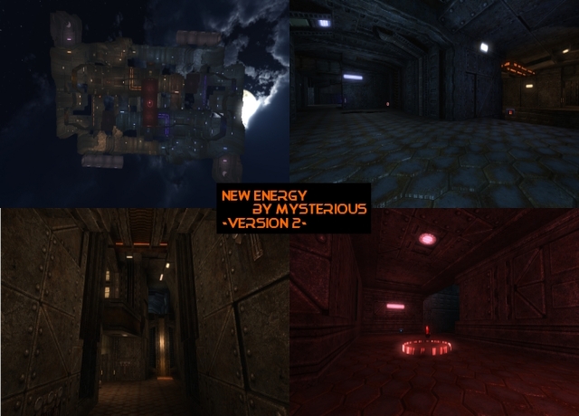
Feels like a damn long time since someone actually posted a map on quadropolis (probably isn't true, but ah well =P).
Content
The content looks quiet good. Not bad to see some reintroduction as you've been away for a long time. The screenshot shows off enough of the map, but it feels like the screenshot are just too small to see it properly.
Theme
The theme seems to be spacish-industrial. Not a bad choice as it fits the layout.
Texturing
The texturing is pretty good. There's a bunch of variety in the textures which have been used, while they provide some contrast also.
It's nice to see you've used a custom config-file to specify textures, but it's pretty pointless to do so when they are exactly specified as in the package.cfg of the textureset (if you're not planning to change any values at all, just use exec packages/name_of_folder/package.cfg to make them appear).
The custom textures are a waste of file-size. Just use texcolor on white.jpg which is located inside the misanthropx folder. If you want to have the exact same colour, just open Microsoft Paint, "absorb" the colour and check out which values it has in RGB. Then take the differences between the parameters and guess how much it would be from 0 to 1 instead of from 0 to 255. I calculated 0.83 0.2125 0.0 for red and 0.336 0.434 1 for blue (for texcolor but for glowcolor as well), try out for yourself.
Pretty interesting you haven't specified the rock1_moss textures while you actually have the chance right now (wouldn't be a bad addition to the map also, especially when it would be textureblended onto walls or ceilings).
The parameters of glowcolor of the light-textures could also be changed so they would fit more to their light-entities.
Geometry
The geometry is fine. It's elegant, yet efficient.
Lighting
There are a lot of lights, which wouldn't be a bad thing if they emit a lot of the same colour. Add some variation of lighting between areas, as the atmosphere is pretty boring right now.
Adding light-entities to those coloured bars isn't a bad idea also, as it looks like they should emit light.
Not sure about the skybox is actually fitting the map, as it isn't emitting any sunlight at all.
Detailing
There have been added pretty much details, but there are several rooms which still feel very empty. Next to that, there isn't anything which looks broken at all; while that's a great way to add detail into a map.
I noticed there isn't any proper reason why the doors are half open. What about adding some (like a something stuck between the door, a broken control panel, etc).
Clipping/Noclipping
The clipping and noclipping seems to be ok.
Flow
As the map has very wide stairs and such, it's not much of a challenge to get a proper flow. This still gives the disadvantage that it's way tougher to travel from 1 side of the doorway to the other (as for crossing it).
There aren't much connections between the layers at all, which could be improved (really takes a while before you finally find something to get up or down).
You bump your head against the ceiling of the lower floor (the basement pathway?) when you jump from the platform which some cubes lower as the platform which the flags are positioned on.
Gameplay
The gameplay seems pretty good. Some more playerstarts could be added (especially because it's such an open map). I'm still missing some GA? It's not bad to add some more depth into the gameplay.
Overall
The map looks pretty good and stable. It still needs some tweaks, but is definitely playable.
