Nice to see a map which finally used some of those textures (still have something to notify though).
Content
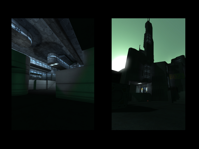
The screenshot looks not bad, but it's not showing off much at all. Only the upper part of the left picture is somewhat interesting, while the lower part has nothing to show at all. Also showing some dark tower isn't really telling much about the map. So I would advice to make screens which show of the layout and such a little better than this.
Theme
The theme seems to be space-like. It could be made even better with way more details like computerpanels and such (take a look at core_refuge and core_transfer, they carry a very similar theme).
Texturing
The texturing is pretty boring. The whole outside construction is just grey with no contrast at all, only the grass provides some but it doesn't seems to be enough. While inside the building every wall is just white. So combine those two at least together to get more interesting result. Also those yellow textures which the texturepack provides could be used.
Geometry
The geometry isn't bad and seems to be pretty efficient.
Lighting
The lighting is somewhat gross. The shadows are way too dark to even see the unlighted surface, which is quiet annoying (and actually never the case so pretty unrealistic, especially on steel panels). Putting the ambient to something like 15 25 20 improves the lighting very well. of course, you still have to lighten up those dark surfaces to have less dark areas and fix up some lighting issues (which you've seem to mask by setting the ambient that low).
Put the skybox in some more realistic angle, as there is light being emitted out of nowhere while like 70 degrees further, a sun is appearing on the skybox.
Try to use not only light with the colour-parameters 140 160 170, as it also is a part of the boring atmosphere.
Detailing
As you already stated, the map is lacking an enormous amount of details. Be sure to trim edges and such, as it looks very unfinished right now.
The bridge really could use some replacement as it looks like it are just 2 huge, folded steel bars and they are somehow connected to each other by 2 other huge steels bars.
What about creating something different as detail for the flag, instead of the jumppads? It now looks like you'll be launched if you would take the flag.
Clipping/Noclipping
The clipping isn't great at all. You bump into doorways (while you don't even have to jump to get that result), keep sticking on the landing-zone. You did a nice job by adding a ceiling of clip though.
Flow
The flow isn't bad, but it still feels pretty flat. Also the jumppads seems to be almost unnecessary to the flag, as a simple riflejump would also get you to the flag. So put the flag away higher (or the jumppads lower) so it really serves it purpose. Also putting the jumppads some further distance away makes it feel more necessary to use them also. The jumppad to the top of each base seems to launch you with no reason at all; pretty unconvincing.
The platform which you can enter by taking the teleport is a nice idea, but it forces you fall all the way down again. What about creating it so you can fall more easily to the upper platform of each base?
Gameplay
The pickup placement is pretty bad. Having 25 health around the map while other pickups aren't appearing in such number is prettty shamefull. I would advice you to add way more grenades (like 16 in total at least), some more rockets (like 8 in total at least) and maybe some more riflerounds also (probably like 12 in total). The amount of playerstarts is pretty good though.
Now the next point about pickups; try no to add them right next to the spot where they could be used at best, as this keeps players on 1 position (which slows down the gameplay). Create a trail where a player could take a weapon that could be used at best in the next situation, so you would "guide" the player to that area (like when grabbing some riflerounds, you won't fight with that in a tight area that obvious so you would move to more open areas).
Overall
This map still has a lot to do. Keep it up, it's still like 50% finished though.
