Content
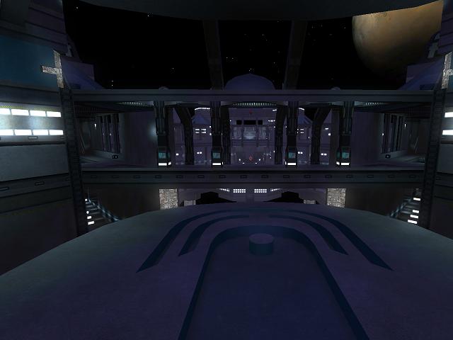
My first thought at the map was, that it probably have somewhat high standards (as the screenshot is quiet nice).
The name, well pretty obvious it relates back to the old map chronos.
Theme
The theme, well obviously space-like. I still would suggest to put it further than 2 sort of concrete bases floating into space.
Texturing
The texturing is pretty odd. I'm really wondering why you've abused the glass texture of trak5 on that way that it isn't emitting any envmap at all (while you still forgot some places). It looks really odd, like some glitched surface. In most cases it doesn't fit the geometry at all.
I would advice you to learn configure the textures, as the trlight06 of than_id isn't convincing that it's emitting any light at all (while it certainly has several light-entities near it).
It seems that there aren't any texturing techniques used so far in the map. Too bad, missed chance. Play along with the shaders could improve the map also. I still provided on quadropolis a texture set which would give ik_gtrimh_46b bump-, height- and spec-mapped textures.
Geometry
The geometry could be improved also. Take the ball at each flag-room for example. With some little practice, I'm sure you could make a better one than this result. This also counts for the dome above each flag-room.
Lighting
The lighting is 1 of the things which really could use a redo. There are light-entities which are having no light-source at all, while others are not convincing to be the light which is a texture is emitting (like for trlight06 of than_id, the light-entities are way too concentrated).
I also would advice you to use some lighting techniques here (like 1 secondary light-entity which has a large radius but isn't intense at all, while having a light-entity with a small radius but a lot of intensity close to the light-source). Spotlights seems also not a bad idea in certain cases.
Detailing
The details is pretty poor and all of the same. The light-sources seems to provide the detail, yet they are being over-used which makes the map pretty boring in that aspect.
Clipping/Noclipping
The clipping/noclipping is the best I've seen on the map.
Flow
The flow in general isn't great at all. You bump against trimmings between glass floors while you bump your head against ceilings (as the ceiling of the staircase to and in the flag-rooms for example).
The only thing which seems to be well-thought are the jumppad, which I somewhat like.
So I would advice you to clip the glass floors (and similar stuff like those diagonal bars) to have some better flow.
It's pretty odd there are 7 ways to each base, while they all are on the lowest floor (and even pretty concentrated also). What about putting 2 ways on the second floor also?
Gameplay
The gameplay isn't that fine also. I noticed that you meet 5 health by taking the jumppad in the base itself, then run over the centre-hall and fall into the other jumppad-gab again. In other words, not very logical as there aren't any other pickups while performing this (it's like the "road of health").
Having 19 riflerounds on the map while it's meant for ctf doesn't seem pretty balanced to me. Also putting 2 rockets next to each other isn't a very great choice to make, as that would give 1 certain person a lot of rockets, while some other which also would like to have some have to search for other sources while it could be done more subtle (and having 10 rockets after a small moment of respawn isn't very logical as you could go call people rocketeers because of that. The same counts for the riflerounds on top of each base. Avoid people have the supplies right away to camp as it really slows down the intention of capture the flag).
Having 69 playerstarts seems to be a decent number, yet not balanced again. So what about adding (or deleting) 1?
Overall
The map reflects that you still have a long way to go. Still, it's not a bad attempt. Keep it up and keep improving the map. It could become something pretty good, as it's not a bad layout (with some adjustments).
